
📝 Context: The Challenge: Busy Teams, Slow Delivery
A Team Lead at a growing SaaS company faces a common paradox: a hardworking team that constantly misses sprint goals. The Kanban board is full, yet tasks drag on forever. Suspecting that excessive multitasking is killing productivity, the Lead struggles to explain to stakeholders why delivery has slowed. They need proof that the pipeline is clogged, not that the team is lazy.
🤔 User Problem: The Team Lead needs to visualize the work in progress over time to prove the team is overloaded and identify exactly when the workflow bottlenecked.
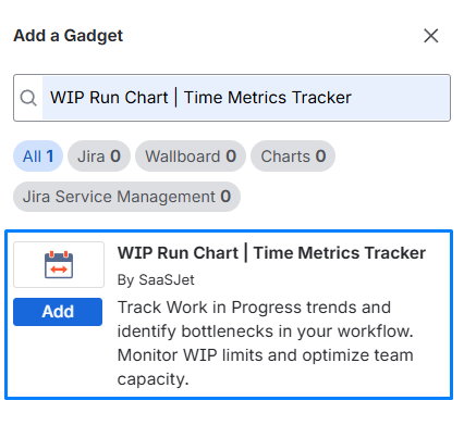
Add the WIP Run Chart Gadget
-
Open your dashboard, click "Add Gadget," and search for "WIP Run Chart."
-
Configure the Basics:
-
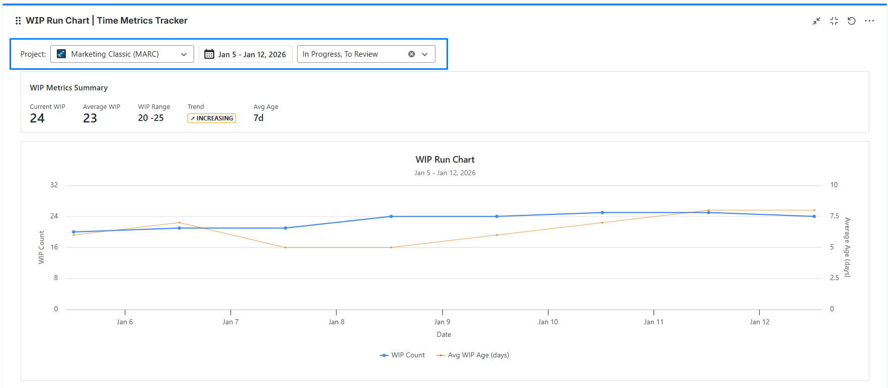
Project Selection: Pick the Jira project you want to analyze.
-
Date Range: Choose from the last 7, 14, 30, 60, or 90 days.
-
Status Selection: The gadget automatically pulls statuses with
statusCategory = "In Progress". You can select all of them (default), focus on specific phases (e.g., only QA), or combine them to match your workflow.
-
📊 How to Read the Chart: Decoding the Data
This chart plots two critical metrics against time to show you the health of your flow.
-
The Axes (The Setup)
-
X-Axis (Time): Represents the calendar days within your selected range.
-
Left Y-Axis (Volume): Corresponds to the Blue Line. It measures the WIP Count (the total number of active tickets).
-
Right Y-Axis (Speed/Health): Corresponds to the Orange Line. It measures the Average WIP Age (how many days, on average, these active tickets have been sitting in the system).
-
The Lines (The Story)
-
The Blue Line (WIP Count): This shows your load. A flat line is good (stability). A rising line means you are starting work faster than you are finishing it.
-
The Orange Line (Avg WIP Age): This shows your staleness. If this line rises, it means tickets are getting "stuck" or ignored, and your cycle time is about to increase.
-
Interpreting the Correlation (The "So What?")
-
The "Bottleneck" Pattern (As seen in the image):
-
In the example above, notice that the Trend is INCREASING.
-
As the Blue Line stays high (around 24 items), the Orange Line begins to climb steadily from 5 days to nearly 8 days.
-
Insight: The team is maintaining a high volume of work, but the work isn't moving. Old tickets are aging, likely due to context switching or blocked dependencies.
-
-
The "Stable" Pattern:
-
Ideally, you want the Blue Line to remain flat and the Orange Line to remain low. This indicates a "One In, One Out" flow where work is completed freshly and doesn't age in the backlog.
-
-
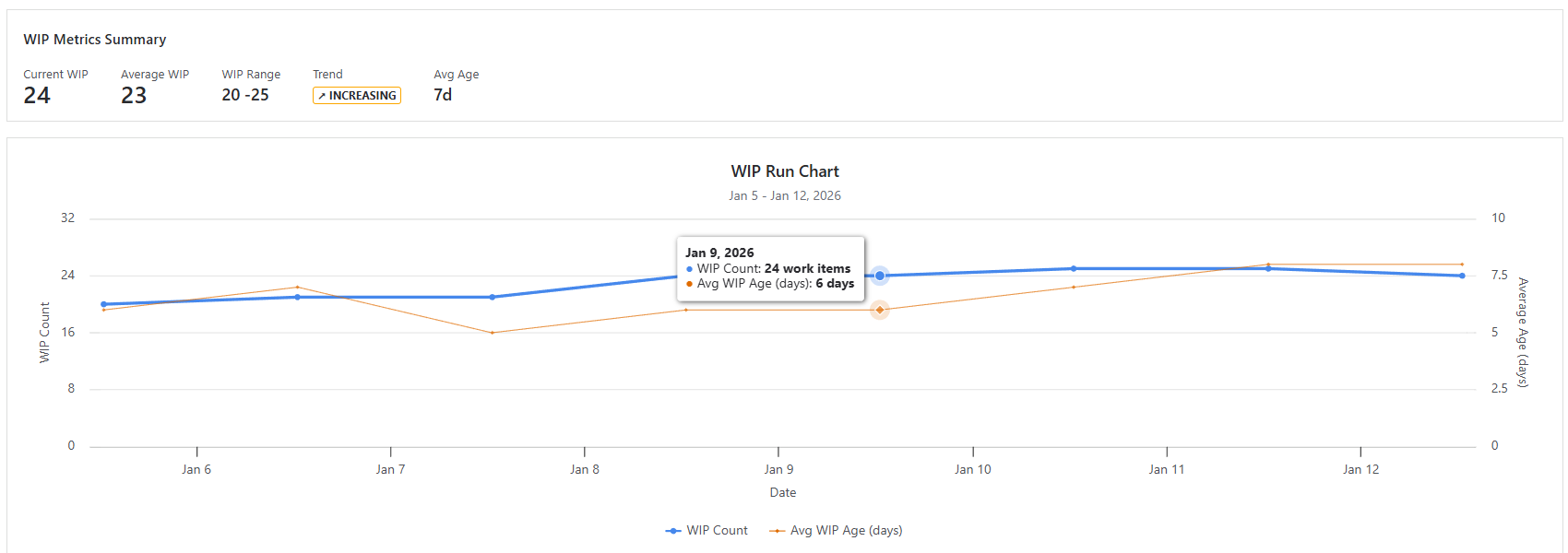
The Tooltips (The Drill-Down)
-
Hover: Hovering over any data point (like Jan 9 in the image) reveals the specific snapshot: WIP Count: 24 and Avg WIP Age: 6 days.
-
Click: Clicking on a data point opens a modal window with detailed WIP info, allowing you to see exactly which 24 tickets were active on that day.
🚀 Impact on the Team
🔹 Stops the Overload. Seeing a rising trend line gives the Lead the authority to say "No" to new requests until the current work comes down.
🔹 Reduces Context Switching. The chart reveals that when WIP goes above 10 items, cycle time doubles. The team agrees to a hard limit, focusing on finishing rather than starting.
🔹 Predictable Delivery With a stable WIP, the team's velocity becomes consistent, making future sprint planning far more accurate.
Haven't used this app yet, then try it now!
If you need help or want to ask questions, please contact SaaSJet Support or email us at support@saasjet.atlassian.net