
What this gadget actually does
The WIP Run Chart shows two very important things every Agile team should keep an eye on:
-
How many work items are currently “In Progress” each day
-
How old are these in-progress work items?
Think of it as your early-warning system for bottlenecks, aging work, and “why is nothing getting done?” moments.
This gadget helps teams:
-
monitor workflow health day by day
-
understand where work is piling up
-
catch aging tasks before they turn into painful cycle time spikes
-
and drill down into details when something looks suspicious on the chart
Who typically uses it
-
Agile coaches & Scrum Masters
-
Delivery / Project managers
-
Team leads
-
Developers & QA who want to understand why the board suddenly looks like a Christmas tree of “In Progress” cards
Where the data comes from
The gadget uses standard Jira fields and historical data from the work item changelog.
Work item fields used
-
Work item
-
Summary
-
Assignee
-
Status
-
Created date
-
Full status history with timestamps (Jira changelog)
Calculated fields
-
WIP Count — how many work items were in a status with
statusCategory = "In Progress"at the end of each day -
WIP Age — how many total calendar days an work item has already spent in any “In Progress” status
-
Average WIP Age — average age of all in-progress items for that specific day
No hard-coded status names — the gadget automatically picks any status under the “In Progress” category (e.g., In Progress, In Review, QA, Blocked, etc.)
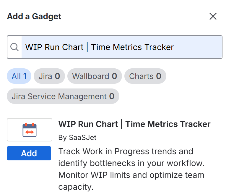
Adding the gadget to your dashboard
-
Go to any Jira Dashboard
-
Click Add gadget
-
Find Time Metrics Tracker | WIP Run Chart
-
Add it
-
Configure the project, date range, and statuses
-
Done 🎉
(The gadget follows your Jira permissions - if you don’t have access to a project or work item, you won’t see it in the chart.)
Configuration Options
1 . Project selection
Pick the Jira project you want the WIP chart for.
The selection will later be persistent (so you don’t lose your setup after page refresh).
2. Date range
Choose:
-
Last 7 days
-
30 days
-
90 days
-
or any custom range
The chart uses calendar days (24/7) - weekends, holidays, everything.
3. Status selection
You’ll see a list of all statuses that belong to statusCategory = "In Progress".
You can:
-
select all of them (default)
-
focus on specific ones (e.g., only QA statuses)
-
or combine them in any way that makes sense for your workflow
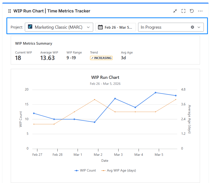
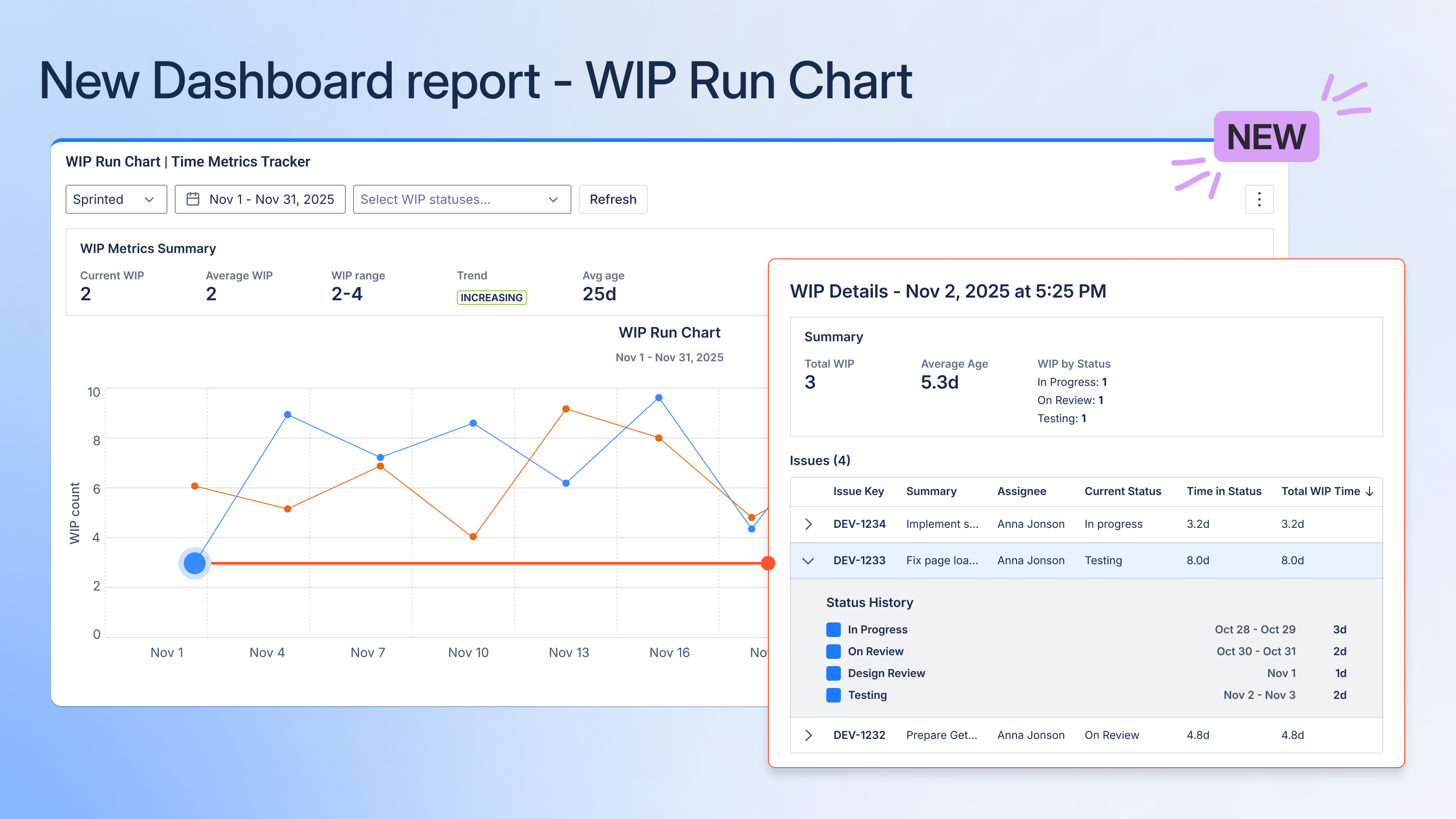
Reading the chart
1. Axes and lines
-
X-axis: calendar days
-
Left Y-axis: WIP Count (blue line)
-
Right Y-axis: Average WIP Age (days) (orange line)
2. Tooltips
Hovering on a data point shows:
-
Date
-
WIP Count
-
Avg WIP Age
Clicking the point opens detailed WIP info in a modal window.
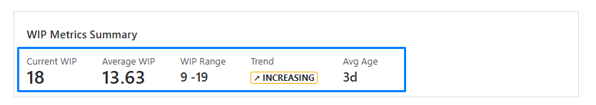
6. Summary metrics (top part of the gadget)
These give you a quick snapshot of your overall flow health:
-
Current WIP
Number of work items in progress on the last day of the selected range. -
Average WIP
Mean WIP Count across all days in the chart. -
WIP Range
Minimum–maximum WIP over the selected timeframe. -
Trend (Stable / Increasing / Decreasing)
Based on the slope of the WIP line — a friendly way of saying
“Is your WIP under control or spiraling?” -
Avg Age
Overall average age of in-progress work across the entire period.
7. Drill-down: WIP Details Modal
Click any point on the chart → you get a detailed snapshot of that day.
1. Modal summary
Shows:
-
Total WIP
-
Average age (days)
-
Breakdown by status (e.g., 6 in Progress, 3 In Review, 2 QA)
2. Work item table
Columns:
-
Work item key (with a link to Jira)
-
Summary
-
Assignee
-
Total WIP Time (days)
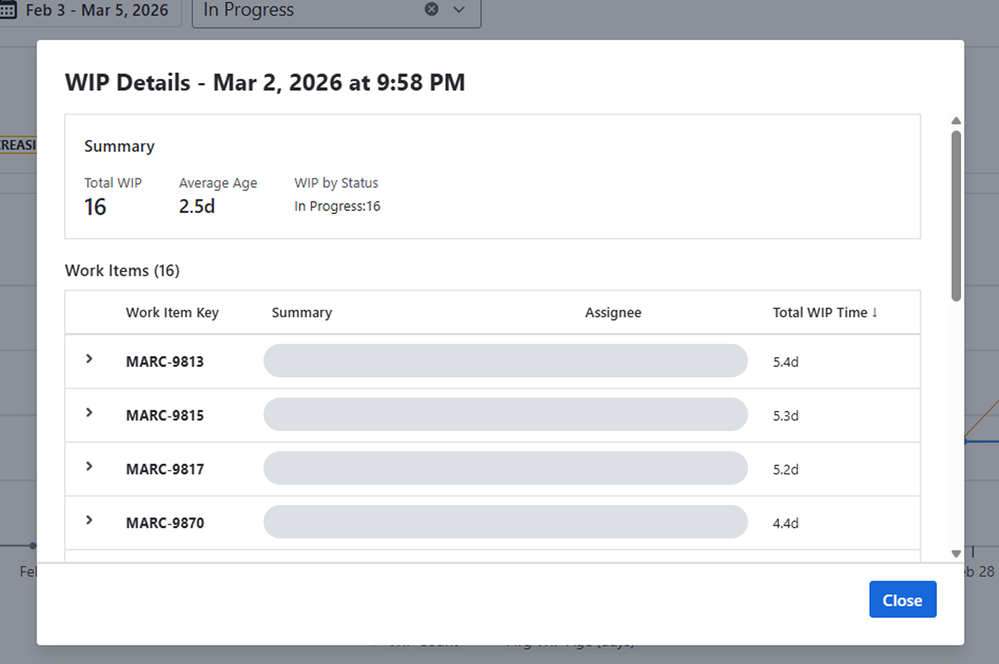
Sorted automatically by Total WIP Time descending, so the oldest items are on top.
8. Detailed Status History (expanded item view)
When you expand a single work item in the modal, you’ll see:
-
A horizontal timeline bar
showing each In-Progress-category status the work item went through
(distinct colors for each status) -
Status durations
shown in calendar days, with start/end timestamps from the changelog -
Total WIP time
sum of all durations in “In Progress” statuses -
Full transition timeline
ideal for spotting things like:-
stuck in review
-
bouncing between QA and Dev
-
work that keeps getting reopened
-
.png?cb=e712b388a5ddb883173ed2cb7241a876)
9. How the calculations work (the nerdy but important part)
1. What counts as WIP
Any work item that at 23:59:59 (workspace timezone) was in a status with:
statusCategory = "In Progress"
2. WIP Count per day
For each day in your date range:
-
look at the work item’s status at the end of the day
-
if its status category is “In Progress” → it counts toward WIP
3. WIP Age per work item
Total time the work item has spent in any In-Progress-category statuses, calculated from:
-
the moment it entered the first In Progress status
-
up to the end of the selected day
-
using calendar days (no workday logic)
Statuses like To Do, Selected for Development, Backlog, Done do not count into WIP Age.
4. Average WIP Age (daily)
Average WIP Age (per day) = Total WIP age of all work items that day ÷ Number of WIP work items that day
5. Summary metrics
-
Current WIP: WIP for the final day
-
Average WIP: mean WIP across all days
-
WIP Range: min–max WIP value
-
Avg Age: aggregated average WIP Age
-
Trend: based on the slope of WIP values across the timeline
10. How to interpret the chart (a quick guide)
Stable WIP + stable Avg WIP Age
Your flow is predictable and healthy.
WIP rising + Avg WIP Age rising
This is the “your system is choking” alert.
Possible reasons:
-
the team is picking up too much work
-
QA / Review / external dependency bottleneck
-
multitasking
-
unclear priorities
WIP decreasing
Often a good signal - delivery is catching up.
Avg WIP Age spikes without WIP Count changes
Classic hidden bottleneck.
Work is aging somewhere (likely review or QA).
11. Practical tips & known limitations
1. Timezone and weekend logic
-
full calendar days
-
includes weekends and holidays
-
based on your Jira workspace timezone
2. Permissions matter
If something looks off (e.g., fewer work items than expected), check Jira project/work item access.
3. Saving configuration
The gadget will support configuration persistence (project, date range, statuses) so you don’t have to re-select everything after a refresh.
12. FAQ
If you need help or want to ask questions, please contact us through SaaSJet Support or via email support@saasjet.atlassian.net
Haven't used this app yet? Try it now! >>>