
The Status Contribution Chart is a Jira dashboard gadget that shows how tracked time is distributed across the statuses of a selected time metric. It gives you a ranked view of where time is spent in your workflow, so you can quickly spot dominant statuses, compare their impact, and identify potential bottlenecks without building manual spreadsheet reports.
Use this gadget to answer questions such as:
-
Which status consumes the largest share of Cycle Time?
-
Is Code Review or QA the dominant bottleneck for your team?
-
Where does time go during support resolution — Investigation or Waiting on customer?
-
How much does each status in a review workflow contribute to the overall lead time?
The Status Contribution Chart helps you:
-
see at a glance where your tracked time actually goes;
-
find the status that contributes the most to delays;
-
compare statuses by both total impact and average per-item impact;
-
move from a chart bar straight to the work items behind it;
-
have one shared reference point for retros, flow reviews, and process discussions.
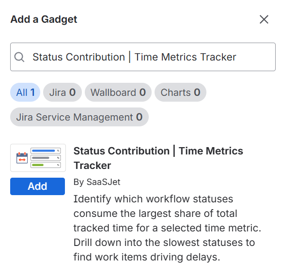
Adding the gadget to your dashboard
-
Go to any Jira Dashboard
-
Click Add gadget
-
Find Status Contribution Chart | Time Metrics Tracker
-
Add it
-
Configure the gadget
-
Done 🎉
The gadget follows your Jira permissions. If you do not have access to a project or work item, you will not see it in the chart or in the drill-down.
Configuration options
You configure the gadget through a settings modal opened from the gear icon.
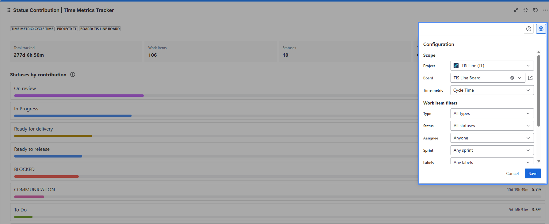
Scope
Choose:
-
Project
-
Board
Time metric
Choose the time metric you want to analyze. The metric defines which work items count as completed and the ordered list of statuses the gadget will compare. If no metrics exist for the project, you will see “No metrics available for this project”.
👉See how to configure the time metric
Work item filters
You can narrow down the work items using:
-
Work item type
-
Status
-
Assignee
-
Sprint
-
Labels
You can also configure:
-
Date range — how far back the gadget looks. Available presets: Last 7 days, Last 30 days, Last 90 days, Last 12 weeks, Last 24 weeks.
-
Format — how durations are displayed: hours/minutes, days, or business days. This changes the display only, not the calculation. Calculations are always based on working time.
How work items are selected
The gadget includes work items that are:
-
completed for the selected time metric
-
updated in the selected date range
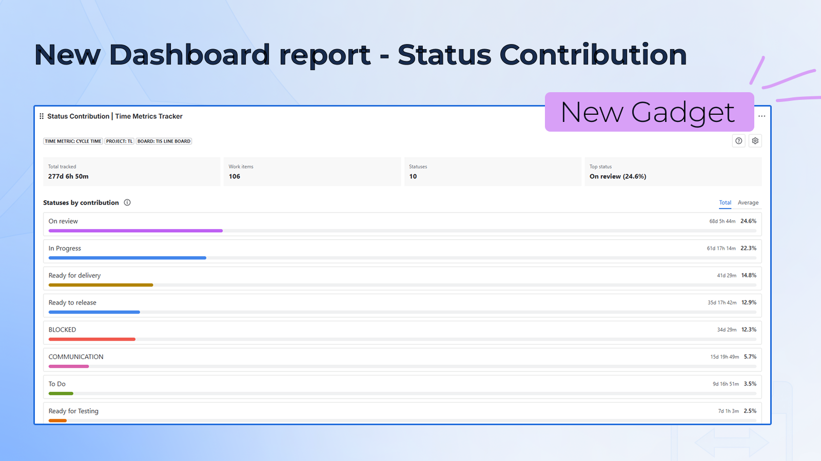
What you see in the gadget
The gadget includes:
The header: shows configuration chips — a compact summary of the active project, board, and time metric. Also contains the help menu (?), the configuration button (⚙), and the About this chart button (ℹ) that explains how to read the gadget.
Summary strip: four KPI cards that give you a quick overview before reading the bars:
-
Total tracked — the total time across all included work items and statuses in the selected date range.
-
Work items — the number of work items included in the current scope.
-
Statuses — the number of statuses that form the selected time metric.
-
Top status — the name of the status with the highest total contribution and its percentage of total tracked time.
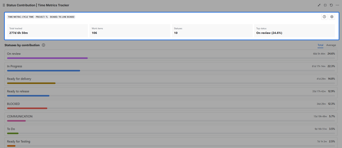
Chart panel: ranked list of horizontal bars, one per status. The status with the highest contribution appears at the top. Each row shows the status name, the time value, the percentage, and a colored bar scaled against the largest value in the current view.
Use the Total / Average toggle to switch between views:
-
Total — bar width and number reflect the cumulative time across all included work items.
-
Average — bar width and number reflect how long a single work item typically spends in this status.
.png?cb=0b764bfe8e416508866804aeb46c7cd7)
Drill-down modal: opens by clicking any status bar. Shows the work items where that status was their biggest time consumer — the items you can bring directly into a retro or process discussion.
Drill-down: opening the work items behind a status
When you click a status row, a drill-down modal opens titled “Main delay”.
The drill-down shows work items where that status is the main delay — the status where the item spent the most time on the metric. At the top, five KPI cards give you a focused view of that status:
-
Status — the name of the selected status.
-
Total time in status — cumulative time spent in this status across all included items.
-
Avg time per task — average time a work item spends in this status.
-
Total share — this status’s share of Total tracked.
-
Avg share — average share of this status within a single item’s metric time.
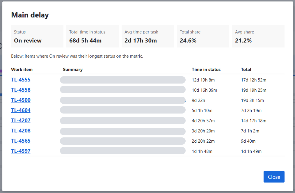
Below the KPIs, a table lists the items where this status was their longest stage. For each item you can see the work item key (as a direct link), summary, time in status, and total time on the metric.
Use this list to:
-
pull the most stuck items into a retro;
-
check whether the same types of items always block at the same status;
-
decide where to apply a process change or WIP limit.
If no items appear, it means the status was added to time across many items but never dominated any single one. Try clicking a different status.
How to read the chart
What each bar means
Bar width is relative — the longest bar always represents the status that contributed the most in the current mode (Total or Average). A wider bar does not mean a fixed amount of time; it means more time than the other statuses in this view.
Each row tells two things at once:
-
Total share — how much of the overall tracked time this status accounts for across the whole team.
-
Avg share — how much of a typical work item’s time is spent in this status.
These two numbers can tell different stories. A status with a high Total share but a low Avg share usually means a few large items inflated the total. Use Total to see team-wide impact; use Average to see the typical per-item experience.
Why one status dominates
A heavily dominant status usually means one of three things:
-
A real bottleneck — limited capacity or an external dependency.
-
A designed waiting state — items rest here by process design (e.g., “Waiting for customer” in support workflows).
-
A misconfigured metric — wrong statuses are mapped in the time metric. The drill-down is the fastest way to tell which one it is.
Empty state
If no work items match the current scope (project, board, metric, filters, date range), the gadget shows an empty state instead of the chart.
This usually means one of the following:
-
there is no completed work for the selected metric in this period;
-
the filters are too narrow;
-
the date range is too short.
Adjust scope, metric, or date range and the chart will update.
Conclusion
Status Contribution Chart helps you move from “this metric is X hours” to “this is the status where most of those hours are spent.” It turns many work items and statuses into one ranked, dashboard-native view, and connects that view to the work items behind every bar.
Add Status Contribution Chart to your Jira dashboard, choose the time metric you want to analyze, and review which statuses take the largest share.
If you need help or want to ask questions, please contact us through SaaSJet Support or via email support@saasjet.atlassian.net
Haven't used this app yet? Try it now! >>>