
Flow Insights helps you understand workflow health directly inside Time Metrics Tracker. It is available on the Main Page and the Jira Space Navigation — the same pages you already use to review work items — so you can analyze trends, bottlenecks, WIP, and outliers without leaving the report.
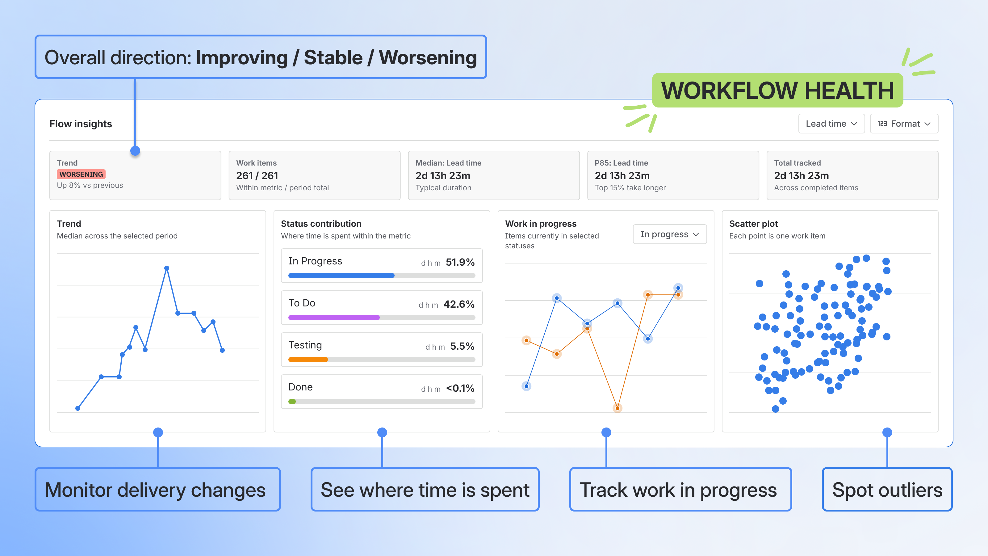
Use Flow Insights to quickly answer questions like:
-
Is our flow getting better, worse, or staying stable?
-
What is the typical time for the selected metric?
-
Are some work items taking much longer than expected?
-
Which workflow stages contribute the most to tracked time?
Where to find Flow Insights
Flow Insights is available on two pages in Time Metrics Tracker:
-
Main Page — across all projects in the selected scope
-
Jira Space Navigation — scoped to the active project
When to use Flow Insights
-
Check flow health during weekly or monthly reporting
-
Understand whether Cycle Time, Lead Time, or Review Time is improving
-
Find workflow stages that consume too much time
-
Investigate aging or blocked work
-
Prepare a quick performance overview for stakeholders
-
Decide whether a deeper analysis is needed
How Flow Insights works
Flow Insights uses the same report context as the page: selected filters, date range, project scope, and active Flow Insights metric.
When you change the project, date range, metric, or additional filters, the Flow Insights panel and full view refresh to match the updated context.
Switching the active metric in Flow Insights does not change the selected metric columns in the work items table. The grid and Flow Insights metric selections stay independent.
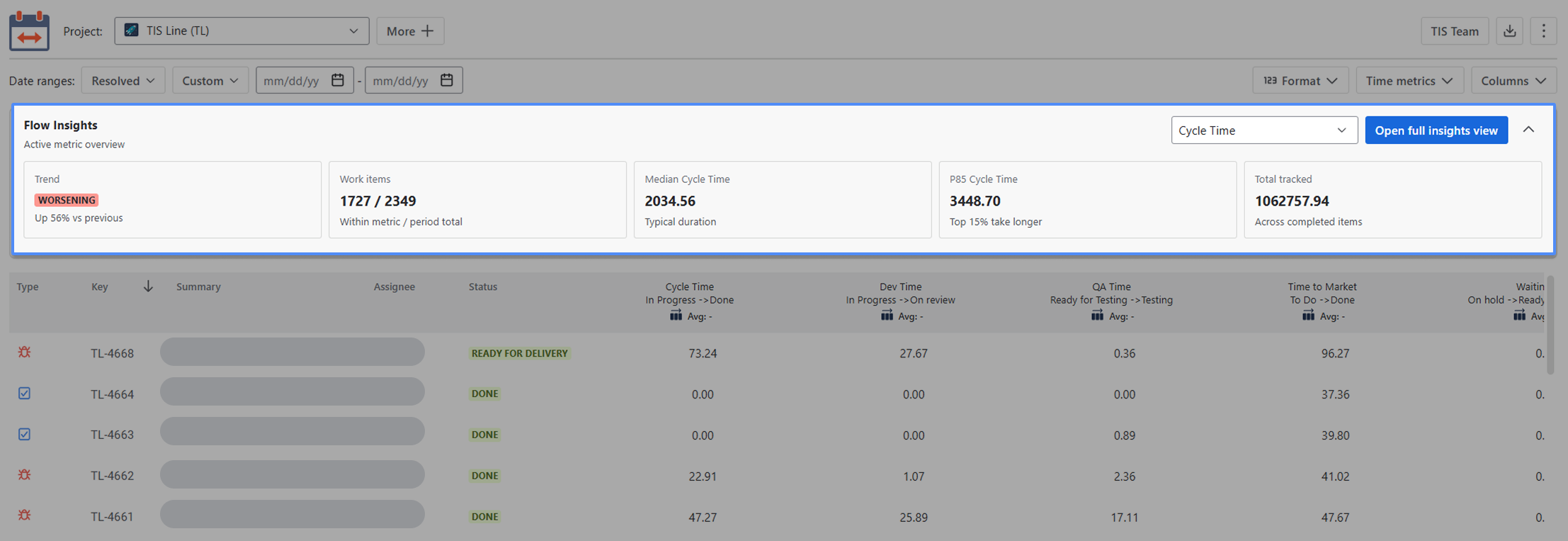
The Flow Insights panel
It contains:
-
Metric selector for choosing the time metric to analyze
-
Arrow button to collapse the panel to a single row of headers or expand it
-
Five KPI cards
-
“Open Full View” button
KPI cards
|
KPI card |
What it shows |
|---|---|
|
Trend |
Shows whether flow is improving, stable, or worsening based on how the selected metric changes across the selected period. The classification threshold is ±5%. |
|
Work items |
Shows how many work items completed the selected metric compared with all items in the selected period. Example: |
|
Median {metric} |
Shows the typical duration for the selected metric. Median is less affected by extreme outliers than an average. |
|
P85 {metric} |
Shows the 85th-percentile duration — how long the slower portion of work items takes. |
|
Total tracked time |
Shows the total accumulated time for the selected metric in the current report context. |
The full Flow Insights view
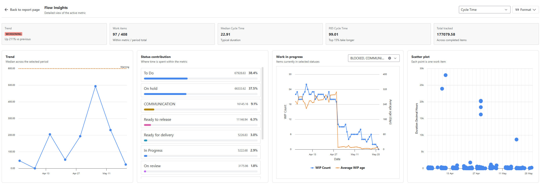
Click Open full insights view to open the full view. The work items grid is temporarily replaced by a dashboard with four charts. Your filters and metric selection are preserved.
Click Back to report page to return to the grid.
Charts
Trend chart
The Trend chart shows how the selected metric changes over the chosen period.
Use it to understand whether your process is becoming faster, slower, or less predictable over time. The chart can also show warning and critical threshold lines if they are configured for the selected metric.
Status contribution chart
The Status contribution chart shows how tracked time is distributed across workflow statuses.
Use it to identify where time is concentrated. For example, you may see that a large share of Cycle Time is spent in Code Review, QA, Waiting for Customer, or another workflow status.
Work in Progress chart
The Work in Progress chart shows how many work items are in selected WIP statuses day by day, together with their average age.
Use it to understand whether too much work is active at the same time or whether items are aging in progress before they become completed-work outliers.
Scatter plot
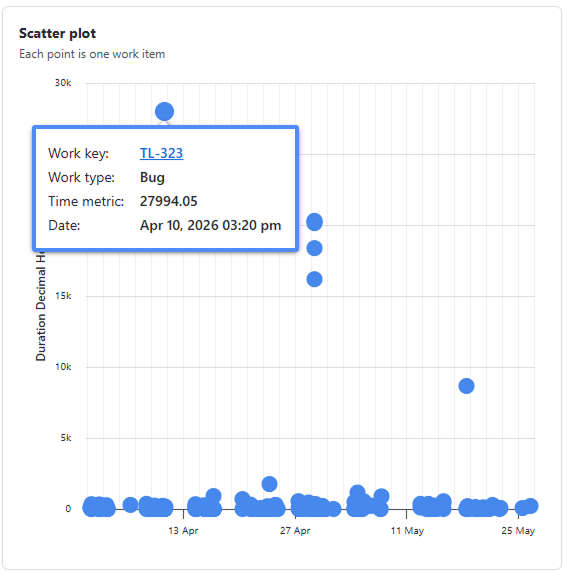
The Scatter plot shows one dot per work item across the selected period.
Use it to see whether delays are spread across many work items or concentrated in a smaller group of outliers. Clicking a point opens the issue in Jira in a new tab.
Drill-downs
Three of the four charts support drill-down modals that list the work items behind the data point:
-
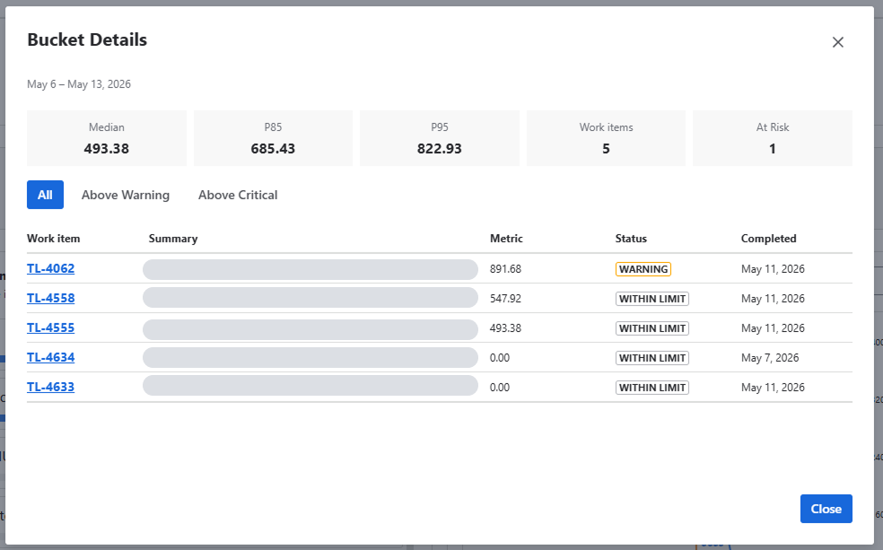
Trend chart → opens Bucket Details with 5 KPIs (Median, P85, P95, Work items, At Risk), a severity filter, and an item table sorted by metric duration.
-
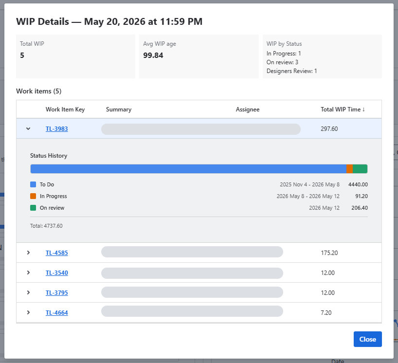
WIP chart → opens WIP Details — {date} with 3 KPIs (Total WIP, Average Age, WIP by Status) and an expandable item table with Status History per row.
-
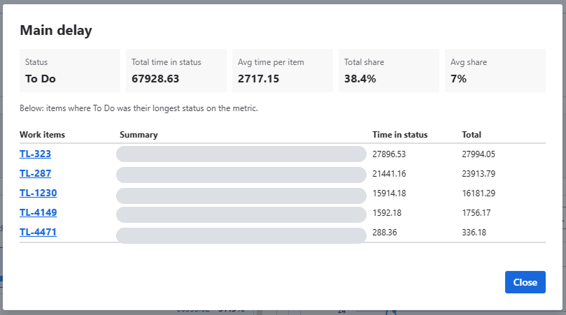
Status contribution chart → opens Main delay with 5 KPIs (Status, Total time in status, Avg time per item, Total share, Avg share) and a table of items where that status was their longest stage on the metric.
-
Scatter plot → no modal, opens the issue directly in Jira in a new tab.
Item keys inside every drill table also open Jira in a new tab.
Example use cases
Weekly delivery review
A team lead opens the Global Page, selects the last 4 weeks, and checks the Flow Insights panel. The Trend card shows "Flow worsening · +81% vs previous." They open the full view, check the Trend chart to confirm the increase is consistent across buckets, then switch to the Status contribution chart to see which stage is accumulating time. They share the chart with the team before the retrospective.
Bottleneck investigation
A Scrum Master notices that P85 Cycle Time is significantly higher than the Median — most items move normally, but a smaller group takes much longer. They open the full view, click a Status contribution bar for the longest stage, and review the Main delay modal. The table shows which specific items spent the most time in that status, making it easy to identify whether the issue is a capacity problem or a process gap.
Spotting WIP overload before it becomes a delay
A delivery manager sees the WIP chart spiking over several consecutive days. They click a high point on the chart to open WIP Details for that date, review the list of active items and their ages, and identify two items that have been in progress for far longer than expected — before they appear as outliers in completed-work metrics.
Stakeholder reporting
A product manager needs to report not just how many items were completed, but how healthy the process looked. They use the Flow Insights panel to show the Trend direction and Median Cycle Time for the period, then open the full view to add chart-level context when stakeholders ask follow-up questions.
FAQ
If you need help or want to ask questions, please contact us through SaaSJet Support or via email support@saasjet.atlassian.net
Haven't used this app yet? Try it now! >>>