
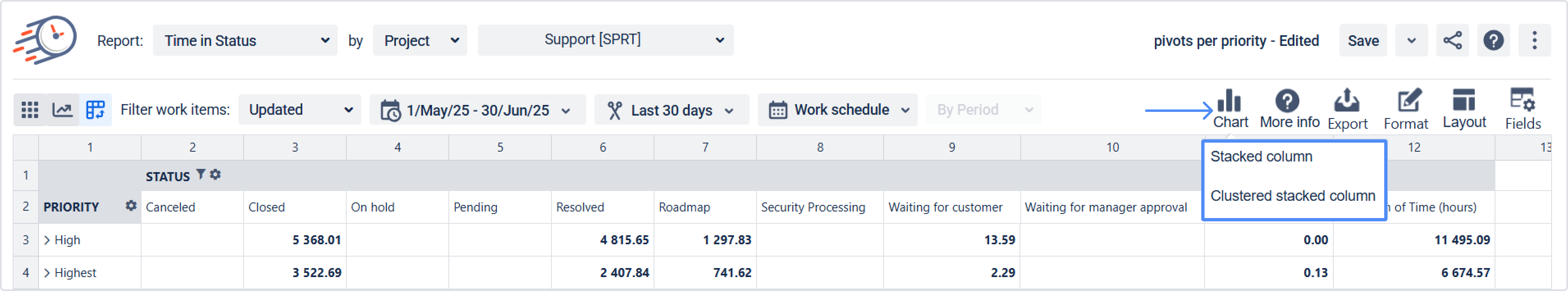
You can also generate Charts in the Pivot table. To get Charts, follow the steps below:
-
Choose the report you need and switch to the Pivot table view by clicking the Pivots icon.

2. Click the Charts icon to present Charts based on a chosen report on the screen.
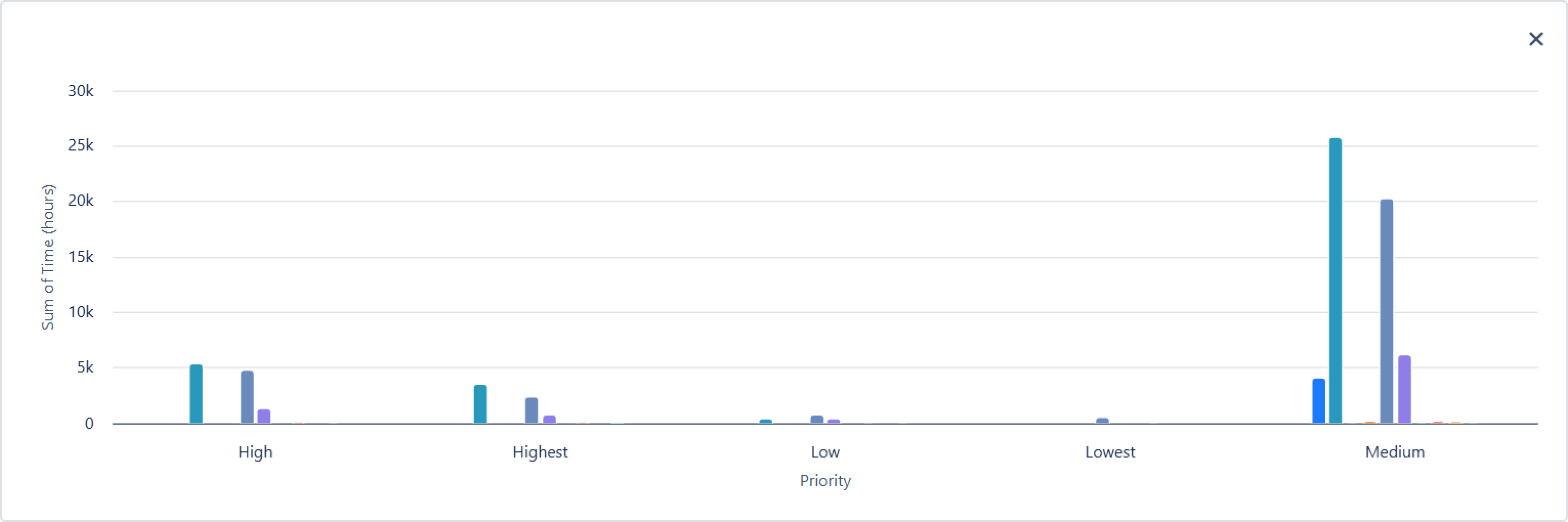
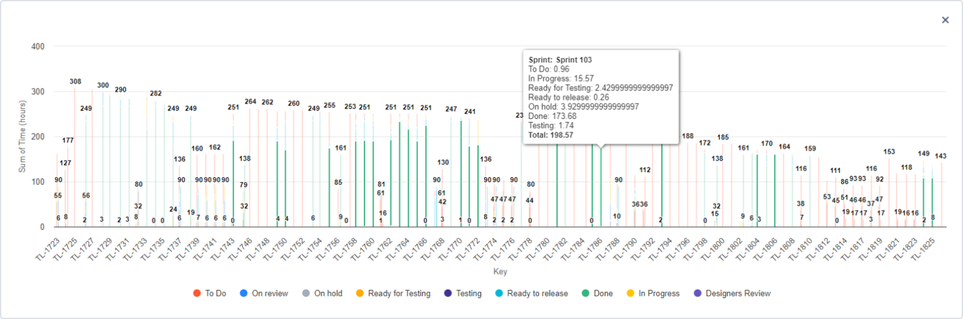
You can choose one of two types of data visualization on the chart.
-
Stacked column:
-
Clustered stacked column:
If you need help or want to ask questions, please contact SaaSJet Support or email us at support@saasjet.atlassian.net
Haven't used this add-on yet? Try it now!