
What are Pivots?
A pivot table is a handy data analysis tool that transforms raw data into easy-to-understand summaries. With pivot tables, you can quickly create helpful visualizations and uncover valuable insights hidden in your data.
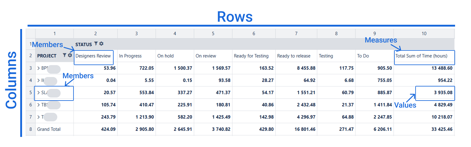
A pivot table has an intuitive and straightforward structure, making it easy to navigate. It consists of three main areas:
-
Rows – display data vertically.
-
Columns – display data horizontally.
-
Cells – contain summarized or aggregated numerical data.
ROWS ("List by"): Choose items or entities you want to list, sort, or expand vertically in your pivot table.
COLUMNS ("Compare by"): Select attributes or categories you want to compare side-by-side, horizontally across your pivot table.
Use Rows for fields with many unique values
For fields such as Assignee, Issue Key, Summary, or Days, which have many unique entries, placing them in Rows ensures your pivot table remains easy to read and manage.
Use Columns for fields with fewer unique values
Fields like Months, Statuses, or Issue Types typically have fewer distinct options, making them ideal to display horizontally as Columns.
Avoid Deep Grouping in Columns
Too many nested levels in columns can complicate readability. To maintain clarity, place deeper groupings in rows rather than Columns.
Why Use Pivot Tables?
Pivot tables are great when you need to quickly summarize, organize, and understand large amounts of data. They help you:
-
Simplify Data: Quickly turn raw, complex data into clear summaries.
-
Spot Patterns: Easily identify trends, patterns, and relationships in your data.
-
Make Informed Decisions: Offer actionable insights to inform strategic choices.
-
Save Time: Efficiently analyze large datasets without complicated formulas.
-
Communicate Clearly: Present findings visually to your team, making it simple to share insights and collaborate effectively.
Pivot Table Functions
Aggregation: Quickly Summarize Your Data
Summarize large amounts of data using handy aggregation functions such as sum, average, maximum, minimum, and more, to reveal key insights at a glance.
.png?cb=5ccffba8028c5ed26613b925600afaff)
Sorting: Keep Your Data Organized
Arrange your data directly in the pivot table according to your needs, making it easier to understand and interpret.
.png?cb=d6cfe87edcbd92bef485531e7c104a0b)
Filtering: Focus on What Matters Most
Less is often more. Filter out unnecessary or redundant data to highlight the information that truly matters. Pivot tables offer three convenient filtering options:
-
Value-based filter: Show only data that meets specific criteria.
-
Member Name Filter: Select members directly by their names or labels.
-
Report filter: Quickly narrow down your data to focus on specific subsets or segments.
.png?cb=370a8893c8420b944d1ca1677b9cc711)
Slicing & Dicing: Explore Data from Different Angles
Want to see your data from various perspectives? Easily rearrange your view with simple drag-and-drop actions. No need to involve IT or create new reports — drag fields around and instantly generate fresh insights.
.png?cb=ff504f1036c391d6456eb1f8d3b7602d)
.png?cb=5f2d7cbe2883ab98163086ed7ecaadbb)
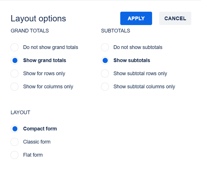
Pivot Table Layouts: Classic, Compact, and Flat
The Pivot Tables view offers three different layouts to help you clearly visualize your data:
-
Compact View (Most Popular & Space Efficient)
The Compact view neatly organizes multiple fields into one column, making the most of your available screen space. It places greater focus on numeric data, displaying hierarchical details in easy-to-use drop-down lists.
-
Classic View (Best for Comprehensive Analysis)
The Classic view resembles familiar Excel pivot tables, with each hierarchy level shown clearly in its own column. This layout allows you to easily view and understand all data levels at a glance, making it ideal for detailed analysis and ongoing reporting.
-
Flat View (Simplest & Raw Data Overview)
The Flat layout presents your data in a simple, table-like form, without aggregation or hierarchical grouping. It's perfect when you need a quick overview and direct access to every individual data record.
Recommended for general use: Classic layout (for clarity and easy analysis)
How to Calculate Time in Days or Business Hours
The time values in the report are displayed in decimal hours. Here's how to convert them into days or business hours easily:
-
To calculate time in days:
Divide the total time by 24.Time in days = Total hours ÷ 24 -
To calculate time in business hours:
Divide the total time by your standard working day length (typically 8 hours, but adjust as needed). The calculation depends on your team's working hours. Make sure the number you're dividing by matches the total number of working hours in your schedule. For example, if your team works an 8-hour day, divide by 8; if it's different, adjust accordingly.Time in business days = Total hours ÷ 8 (or your daily working hours)
Adjust the calculation based on your team's working hours for accurate results.
.png?cb=f544eb970729ea8dff802f041996b118)
Historical Data in Pivot Tables
In the Time in Status app, pivot tables don't just show the current state of tasks—they also display historical data. For example, if you include the Story Points field in your pivot report, you can easily view how the value of this field has changed over time. This helps you understand task progress and identify trends or changes in your workflow.
.png?cb=f5fda42fcd546f124de11391dcb17cf6)
Reporting by Periods
Use the TIS Period option to generate reports based on different time periods. Select the time frame you need, and the report will show your data for that specific period.
.png?cb=0b8e2a05af0e7a5736705fafad35c8ea)
.png?cb=fcb1398ad37b26c7b4fbedfe3a1f0ded)
If you need help or want to ask questions, please contact SaaSJet Support or email us at support@saasjet.atlassian.net
Haven't used this add-on yet? Try it now!