Customizing Jira Dashboards and Analytics: A Guide
📝 Context: In Jira, a dashboard is a customizable interactive page that visually represents relevant information from your projects. Dashboards help users track, analyze, and share information about their projects and team progress. They can be customized to meet the specific needs of different users and roles in the organization. This guide explains how to create a Jira dashboard using the gadgets from the Time in Status app. |
|---|
🤔 User Problem: Teams need a way to create customizable dashboards that provide a visual representation of relevant information from their projects. The Time in Status app offers various reports that can be added to dashboards to help users track, analyze, and share information about their projects and team progress. |
|---|
First, you must create a Jira dashboard. Go to the Dashboard tab in the top menu.

Next, click the Create Dashboard button and set the permissions for your new dashboard. You can choose who can view this dashboard, who can edit it, or you can make it completely private.
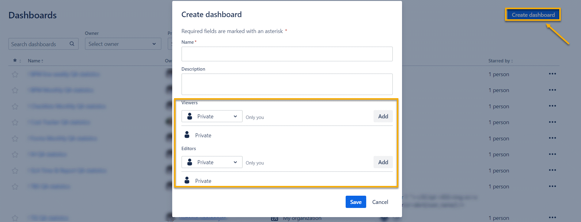
And that's it; now you have a ready-made dashboard.
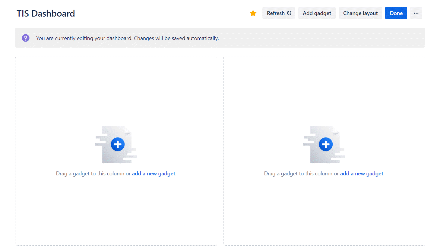
Let's start filling it in.
Time in Status Dashboard Gadgets
Find Accurate Time in Status in the list of gadgets in the right column and click the Add button.
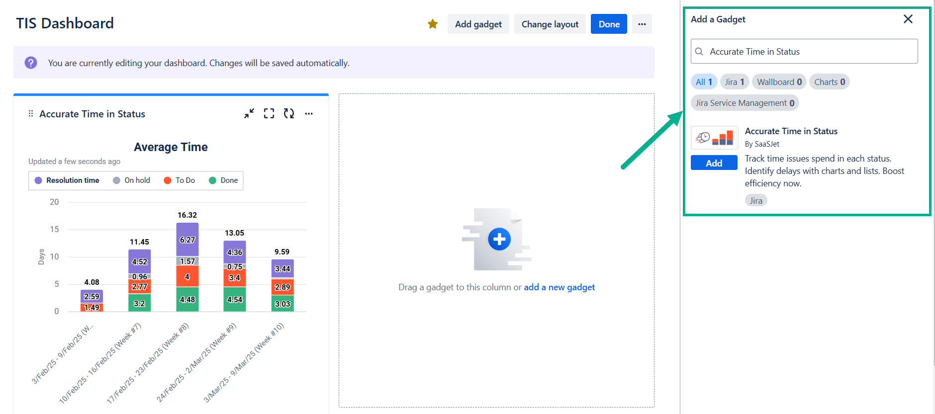
The gadget will appear in the first section, and you can configure it.
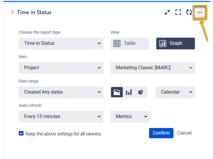
Next, in the settings, you have access to advanced gadget customization functionality:
one of 7 reports and a choice of table or chart view;
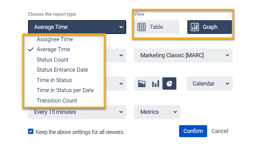
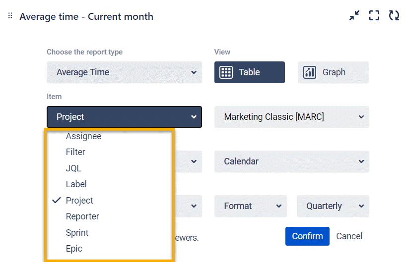
a wide range of filters;
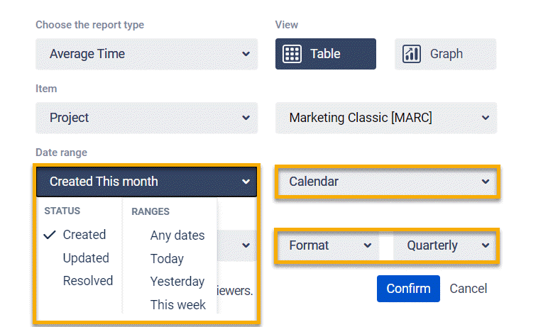
date ranges, selection of the working calendar, and the required format for display;
and, of course, you can choose from three types of charts.
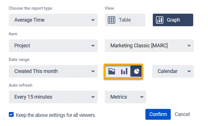
Note that you can also set the parameters for updating information on gadgets. At a minimum, auto-refresh occurs every 15 minutes.
Here's what the dashboard looks like with some reports from the Time in Status app added.
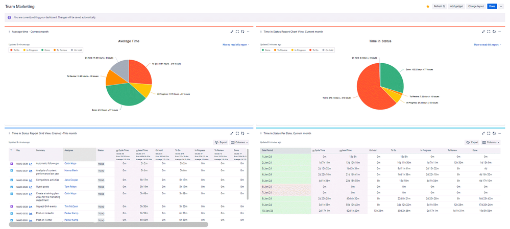
So, which reports did we choose for our dashboard?
Time in Status Report
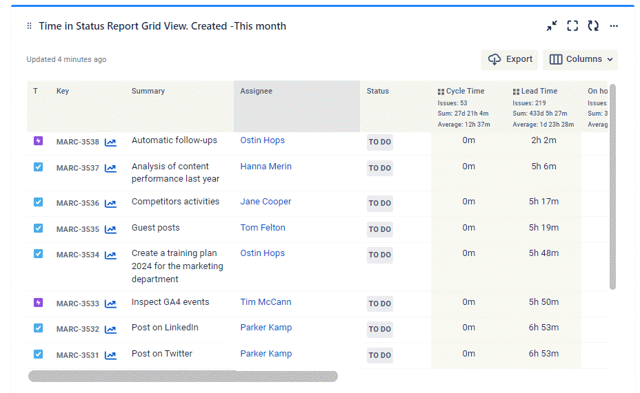
Previously, the Cycle and Lead time calculation group statuses were set up. You can customize the grid view using the Column Manager to ensure you have only the necessary fields at your fingertips.
Time in Status per Date Report
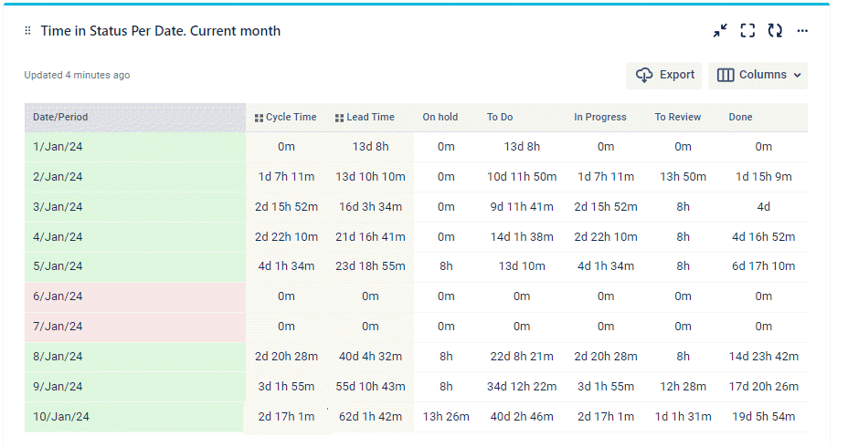
The Time in Status per Date report sums up the time the task has been staying in each status at a particular date.
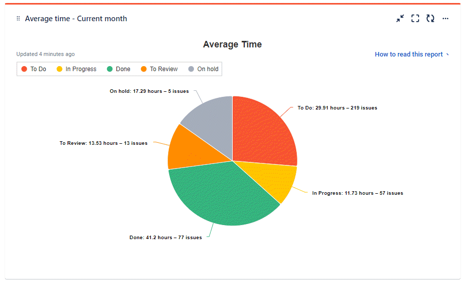
Average Time Chart
One of the most popular reports and charts. The Average time report shows the average time issues have been staying in statuses during a specific period.
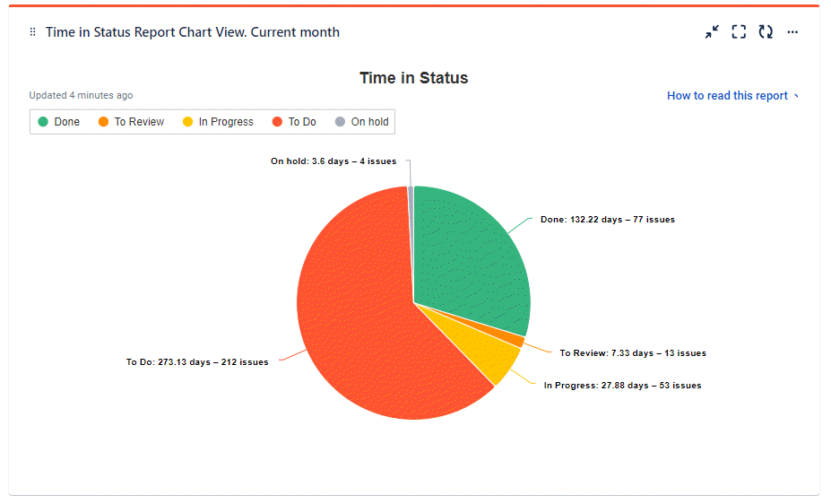
Time in Status Chart
If a grid view is necessary for a specific list of tasks and their indicators, then the Time in Status chart is necessary for visualizing these indicators.
It's no secret that graphical views are designed for analytics and give you a bird's eye view of the situation.
📈 Outcomes:
|
|---|
If you need help or want to ask questions, please contact SaaSJet Support or email us at support@saasjet.atlassian.net
Haven't used this add-on yet? Try it now