
SLA Chart Reports provide a visual view of SLA performance for selected work items and SLA configurations.
Use charts to review SLA results over time, compare SLA performance, identify exceeded goals, and understand where SLA issues are concentrated.
To open SLA Chart Reports:
-
Open SLA Time and Report from the Jira Apps menu.
-
On the main page, click the Chart view button in the upper-left corner.
.jpg?cb=92451c07f2c955bf1dc363d9748f9a26)
Choose a chart
Start by selecting the chart that matches the question you want to answer. Available chart types:
Select work items
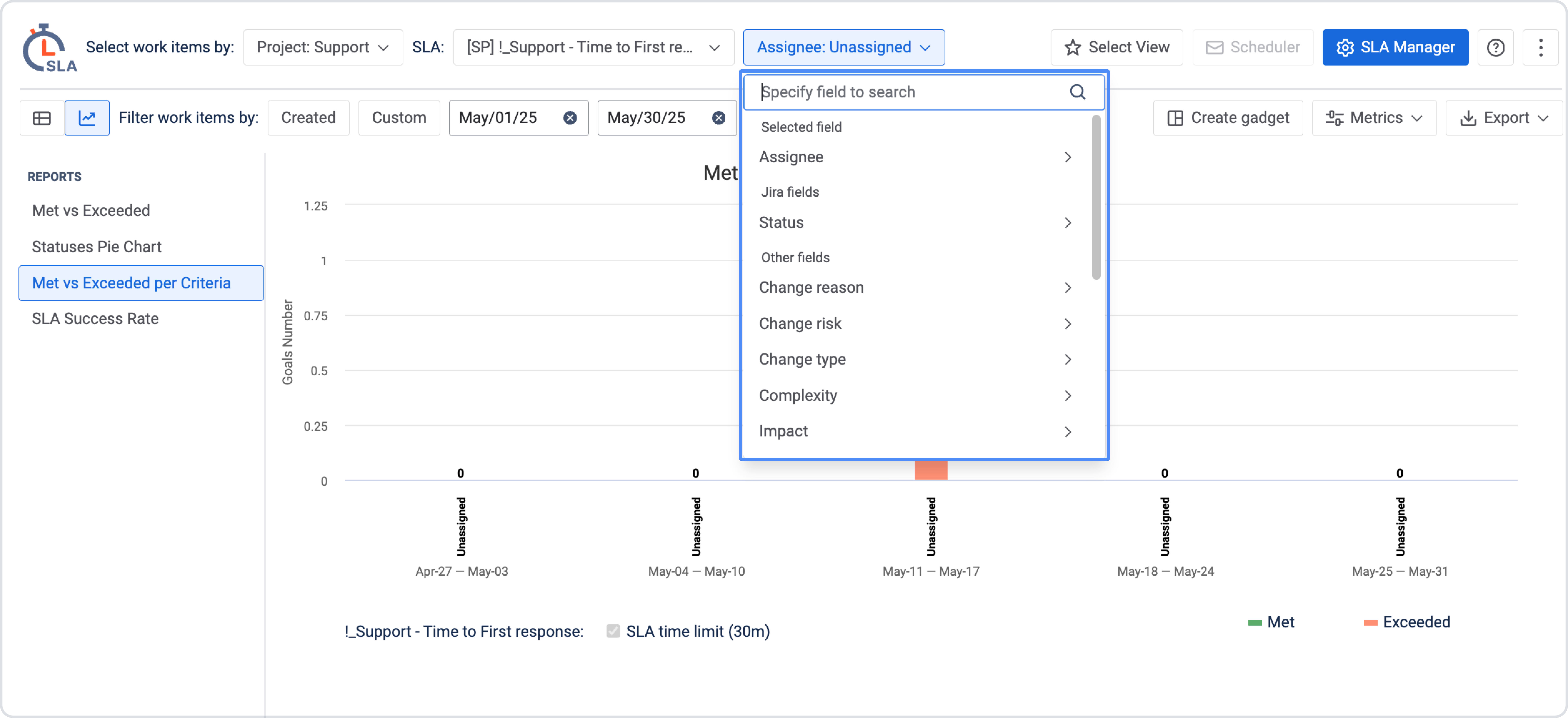
Use Select work items by to define which work items should be included in the chart. You can select work items by: Project, SLA Config, Filter, JQL, Sprint, Label, Reporter.
After selecting the work item scope, choose the SLA configuration you want to display.
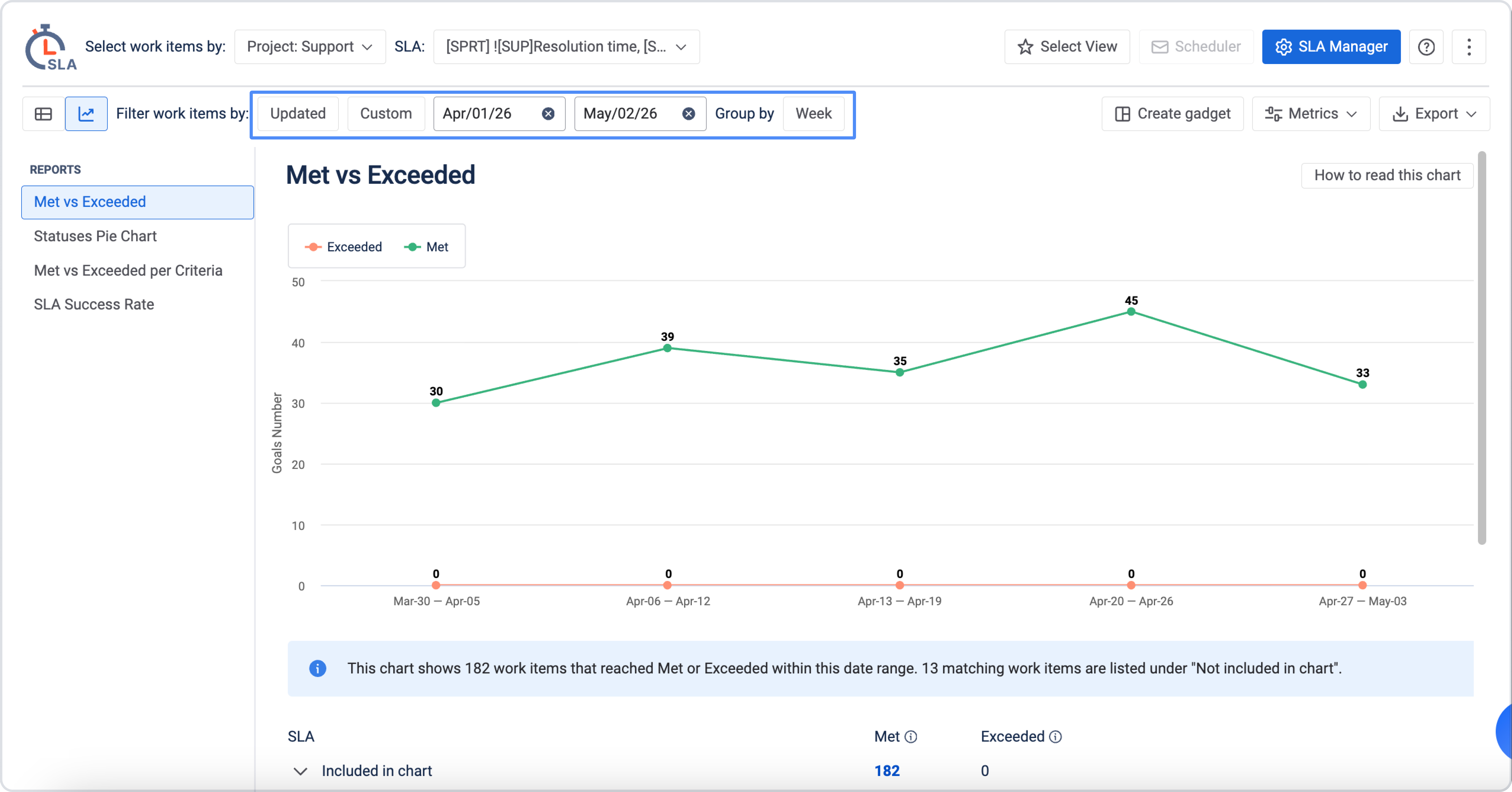
Filter work items by date
Use Filter work items by to select the date field and reporting period. You can filter work items by:
-
Created – includes work items created during the selected date range.
-
Updated – includes work items updated during the selected date range.
-
Resolved – includes work items resolved during the selected date range.
Choose a predefined range, such as last week or this month, or select a custom date range. The selected date range defines which work items are included in the chart.
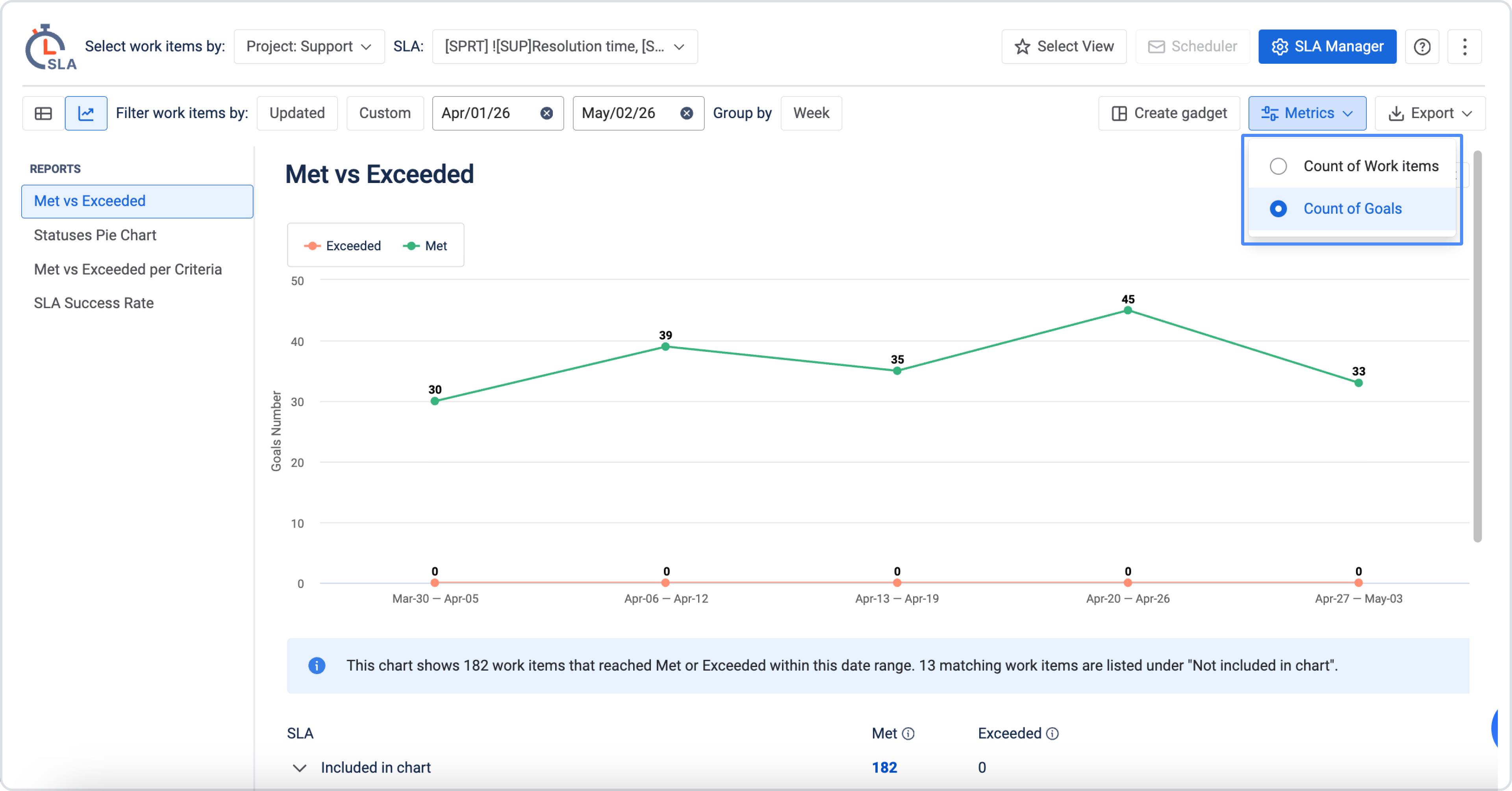
Choose the chart metric
After selecting work items and the date range, choose the chart that best fits your analysis. Each chart shows SLA data differently and helps answer a different question.
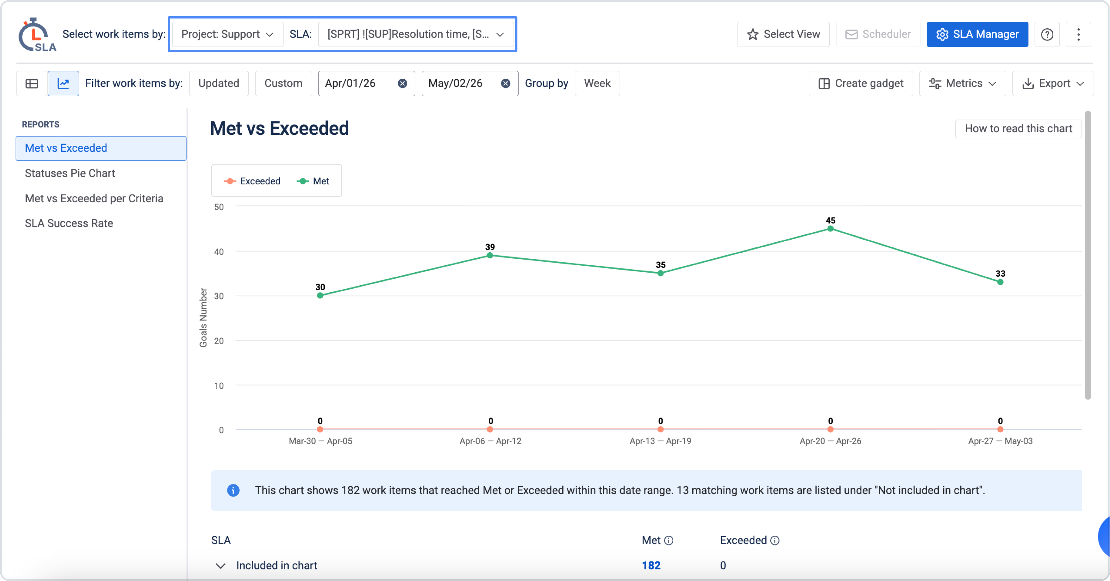
SLA Met vs Exceeded chart
The Met vs Exceeded line graph shows trend data for SLA results that reached Met or Exceeded during the period displayed in the chart.
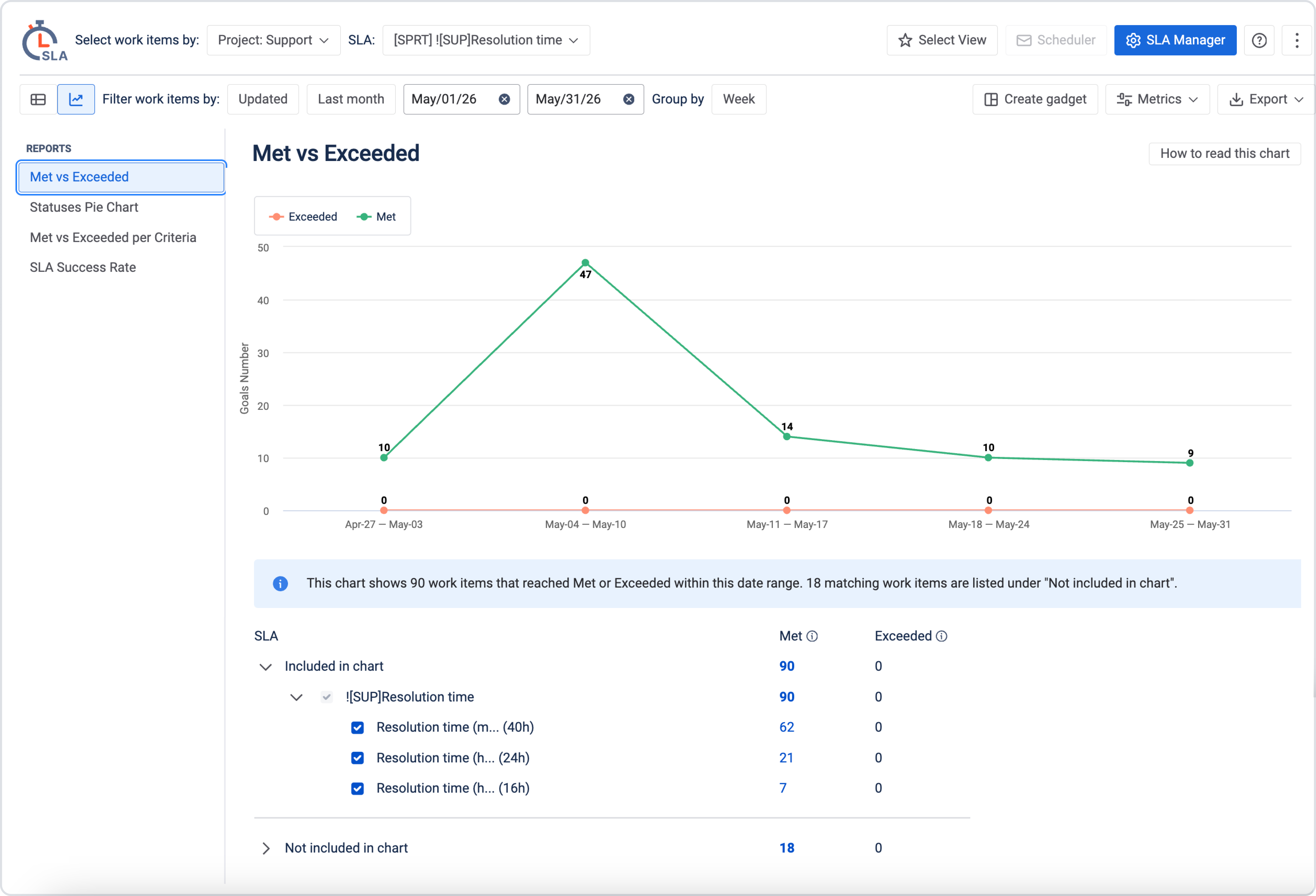
-
Met shows SLA goals completed within the configured time or deadline.
-
Exceeded shows SLA goals that were completed after the configured target.
Use this chart to track how met and exceeded SLA results change over time. It helps you identify whether exceeded SLA goals are increasing, decreasing, or concentrated during a specific period. For example, a sudden increase in exceeded goals may point to a workload spike, delayed handoffs, unavailable resources, or another workflow issue.
What is not included in the chart
This chart includes only SLA results that reached Met or Exceeded during the period displayed in the chart.
Work items that match the selected filters but reached Met or Exceeded outside the displayed period are not shown in the chart. They are listed under Not included in chart in the table below.
Please note that:
-
These tickets are excluded from SLA chart calculations
-
They will not be displayed on the chart, even though they fall within the selected date range by creation, update, or resolution date
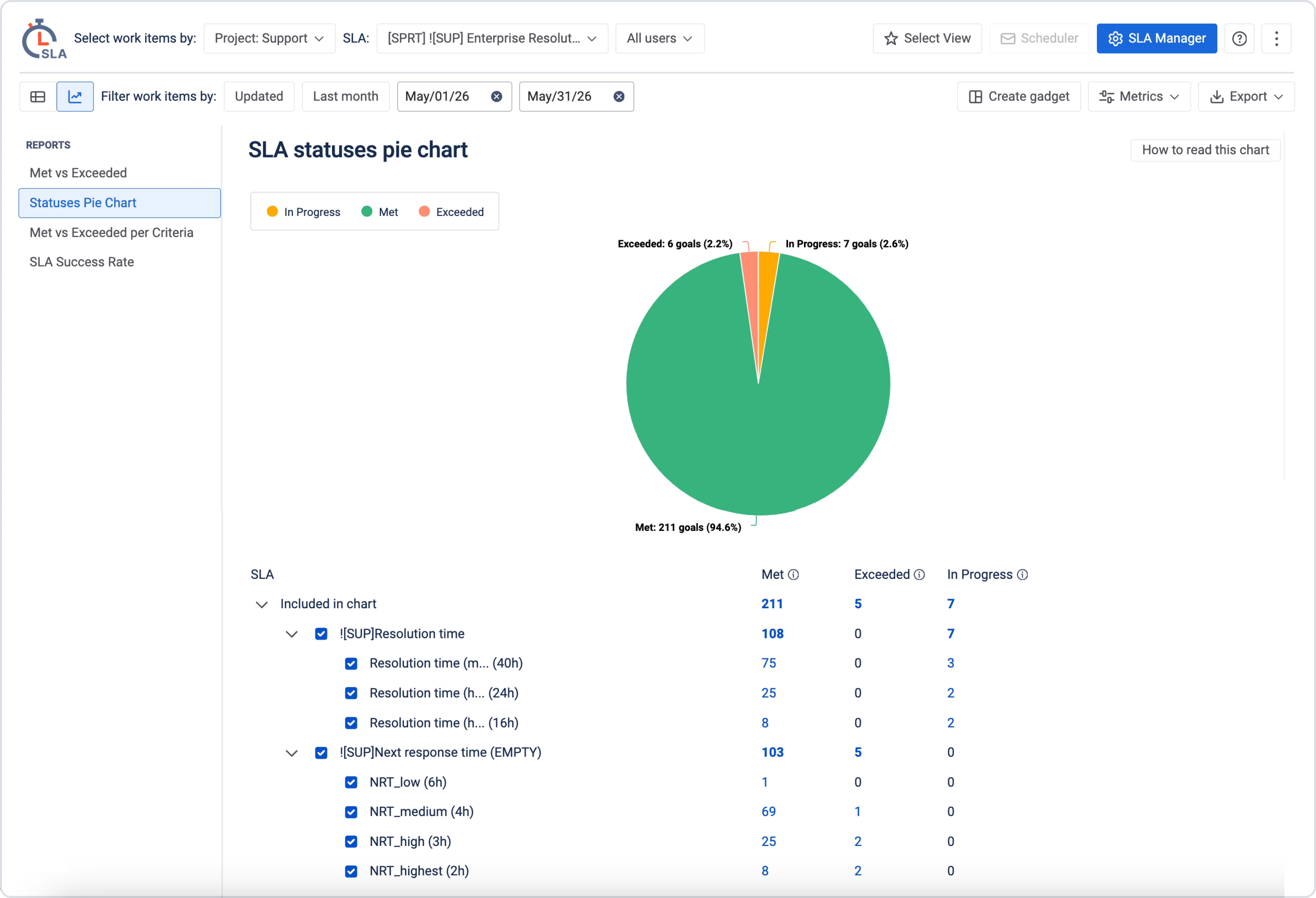
SLA Statuses Pie Chart
Use the SLA Statuses Pie Chart to see the current distribution of SLA statuses in the selected work item scope.
The chart shows the ratio of SLA goals with these statuses:
-
In progress – SLA goals that are still active.
-
Met – SLA goals completed within their configured targets.
-
Exceeded – SLA goals completed after their configured targets.
Use this chart when you need to quickly understand:
-
the current SLA situation for a selected project or team;
-
how much work is still in progress;
-
whether exceeded goals represent a significant part of the workload;
-
the overall SLA status before a team review or management update.
Met vs Exceeded per Criteria
Use Met vs Exceeded per Criteria to compare SLA results across a selected Jira field or custom criterion. Instead of viewing all SLA results together, this chart groups met and exceeded goals by a criterion you select.
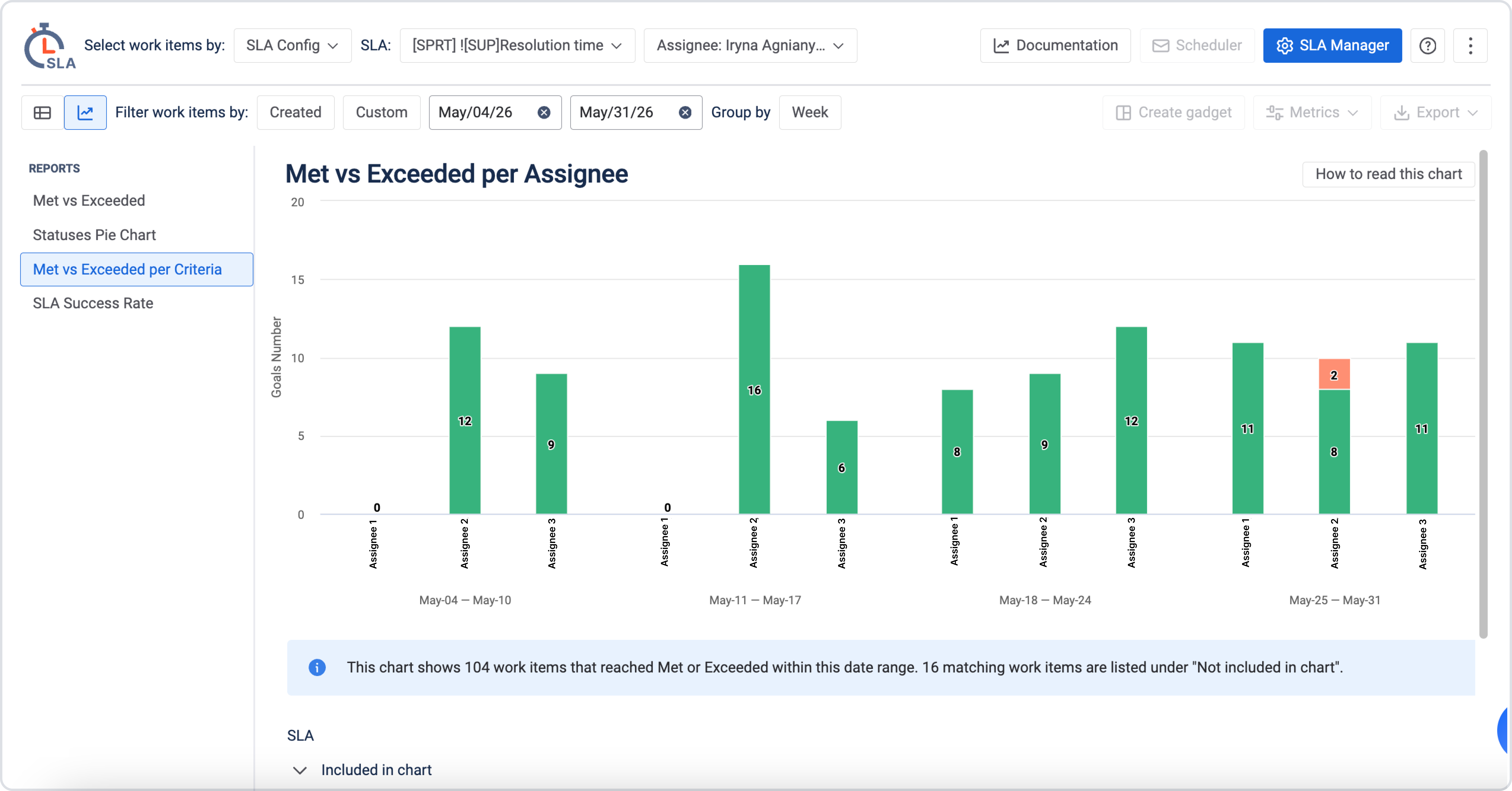
Available criteria can include:
-
Assignee
-
Priority
-
Severity
-
Organization
-
Project
-
Label
-
Reporter
-
SLA configuration
-
other available Jira or custom fields
You can use the search option to find the criteria you need.
Once you select a criterion, you can choose up to 8 values (for example, up to 8 assignees or severity levels).
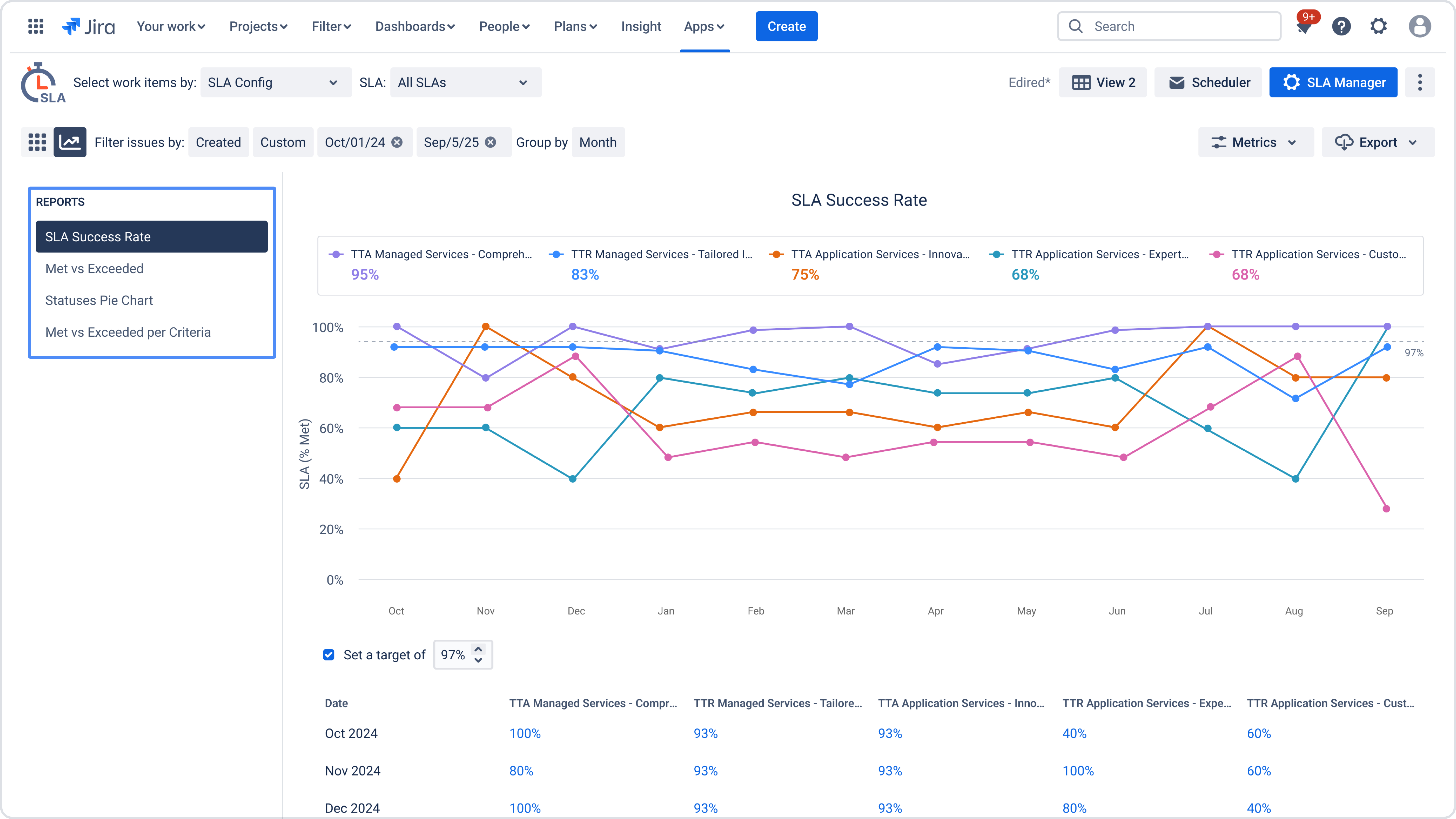
SLA Performance Comparison Chart (SLA Success Rate)
SLA Performance Comparison Chart (SLA Success Rate) helps visualize how well multiple SLAs are met over time and compare their performance within a selected date range.
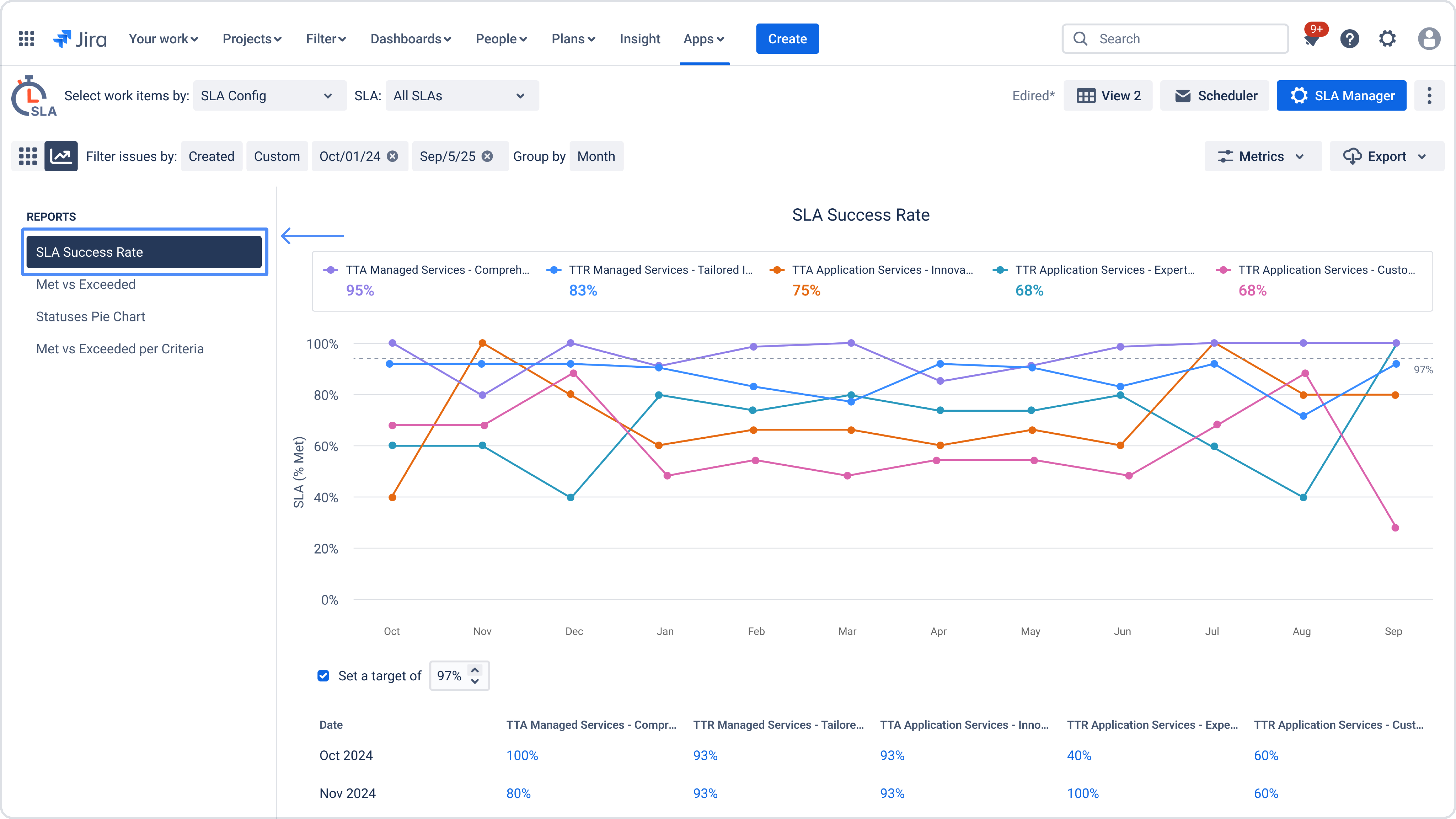
This chart shows the percentage of “Met” SLAs for each selected SLA and makes it easy to spot trends, differences, and inconsistencies between SLAs.
It is especially useful when you need to:
-
Compare multiple SLAs side by side
-
Track SLA performance dynamics over time
-
Identify SLAs that consistently underperform or fluctuate
Date range and grouping
-
You can select any custom date range
-
Data is calculated and grouped based on the selected range (for example, by month)
-
Only SLA results that fall within the selected date range are included
How SLA success rate is calculated
For each selected SLA and time period, the chart displays:
SLA Success Rate (%) = (Number of Met SLAs / Total SLAs in the period) × 100
Only SLAs with the Met status are counted. Exceeded or non-started SLAs are excluded from this chart.
When to use this chart
Use the SLA Performance Comparison Chart when you need to:
-
Compare Time to First Response vs Time to Resolution SLAs
-
Analyze SLA performance across different teams or workflows
-
Validate whether SLA targets are consistently achievable
-
Support management reporting with clear, comparable SLA metrics
Please note:
This chart focuses on SLA success rate only. For detailed breach analysis or breakdown by criteria, use Met vs Exceeded or Met vs Exceeded per Criteria charts.
Target line (SLA performance target)
The Target line allows you to define a minimum acceptable SLA success rate and visually compare actual SLA performance against this goal.
When enabled, the chart displays a horizontal target line across the graph, making it easy to see whether selected SLAs meet or fall below the expected performance level.
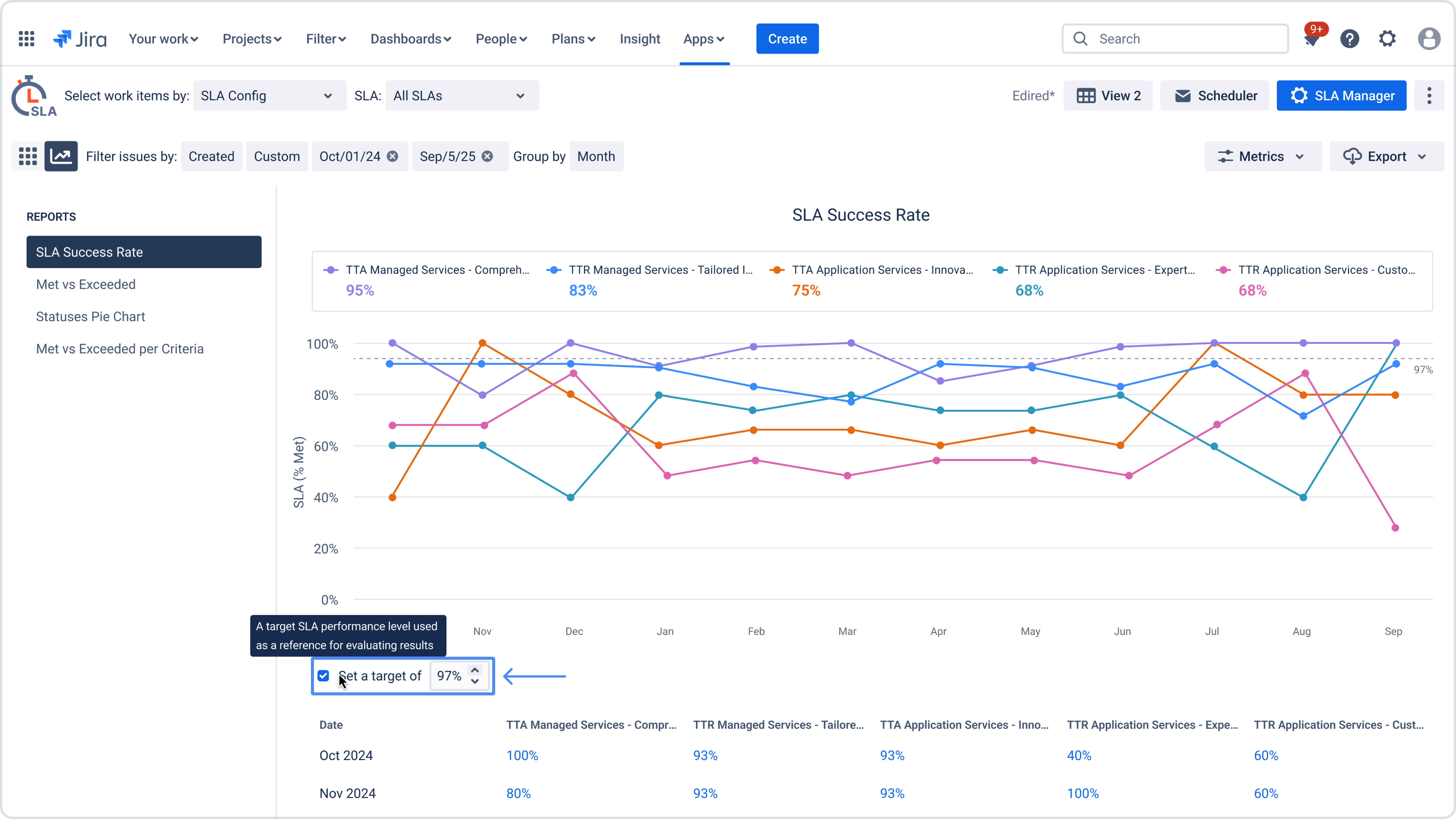
How the target line works
-
You can set a custom target value (for example, 80% or 95%)
-
The target is applied across the entire selected date range
-
All SLA performance lines are visually compared against the same target
-
The target line does not affect calculations – it is used for visual reference only
How to read the table under the chart
.jpg?cb=360f4156dbe5b17d894d40b8757720cb)
The table below the charts provides more details on the SLA data used in the report. The SLA column shows SLA configurations and their related SLA goals.
The Met and Exceeded columns show the number of SLA goal results for each status.
One work item can have more than one SLA goal result. Because of this, the number shown in the table may be higher than the number of unique work items opened in Jira. Linked numbers open the related work items in Jira.
Included in chart
.jpg?cb=ab5a7c8b6bd317432ea27b1a07fe4add)
The Included in chart section shows SLA results that are used in the current chart.
For Met vs Exceeded and Met vs Exceeded per Criteria, this section includes SLA results that reached Met or Exceeded during the period displayed in the chart.
Not included in chart
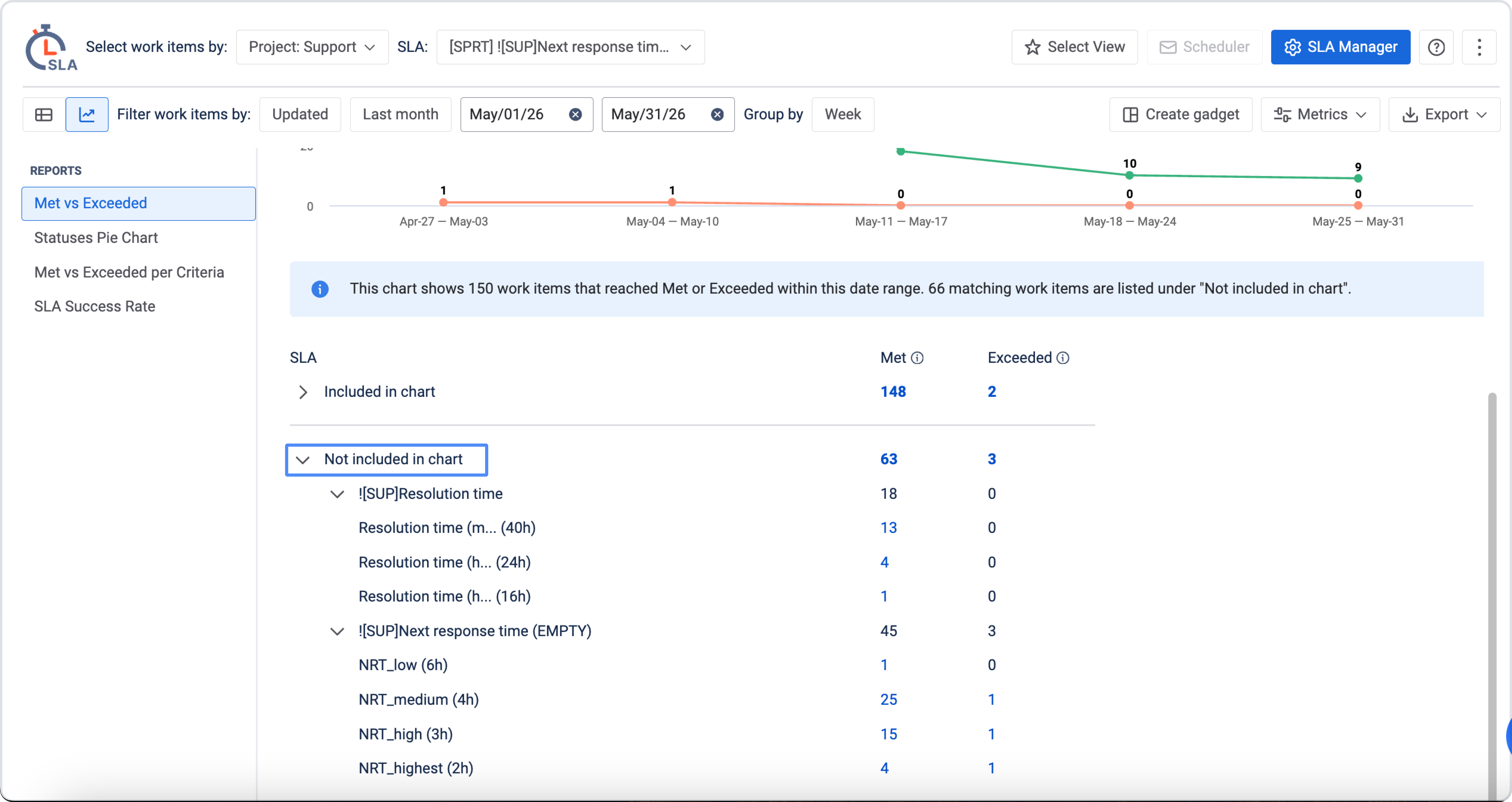
The Not included in chart section shows matching SLA results that are not displayed in the chart. This can happen when a work item matches the selected filters, but its SLA result:
-
is still in progress;
-
reached Met or Exceeded outside the period displayed in the chart;
-
does not match the logic of the selected chart type.
These results are shown separately so you can review them without affecting the chart visualization.
All graphs are available for export in PNG, JPEG, PDF, or SVG format.
Helpful resources & links