
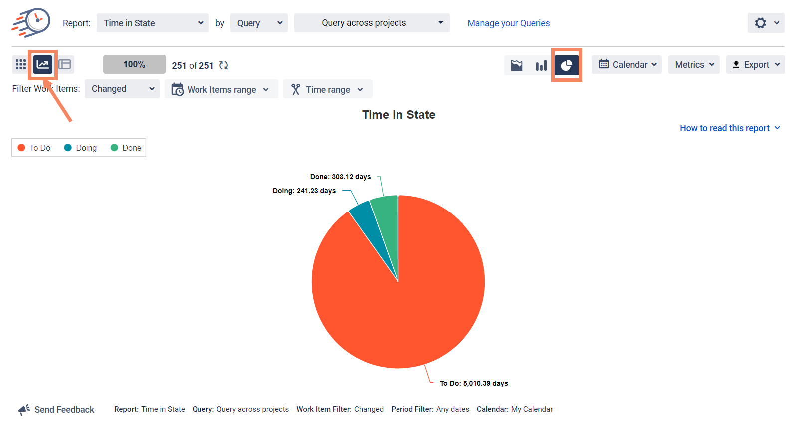
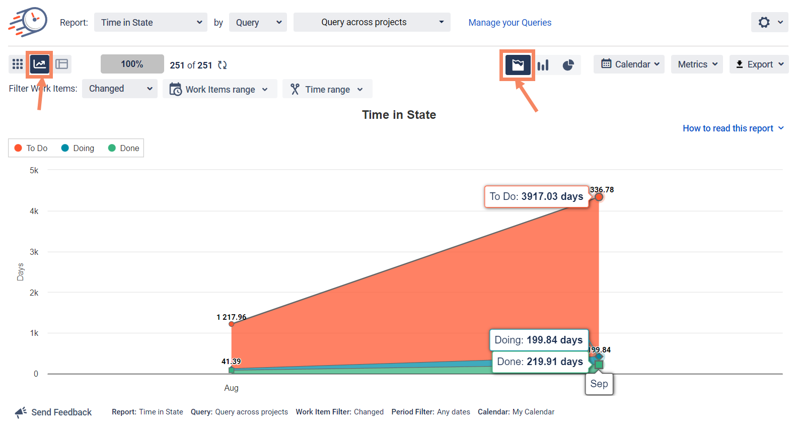
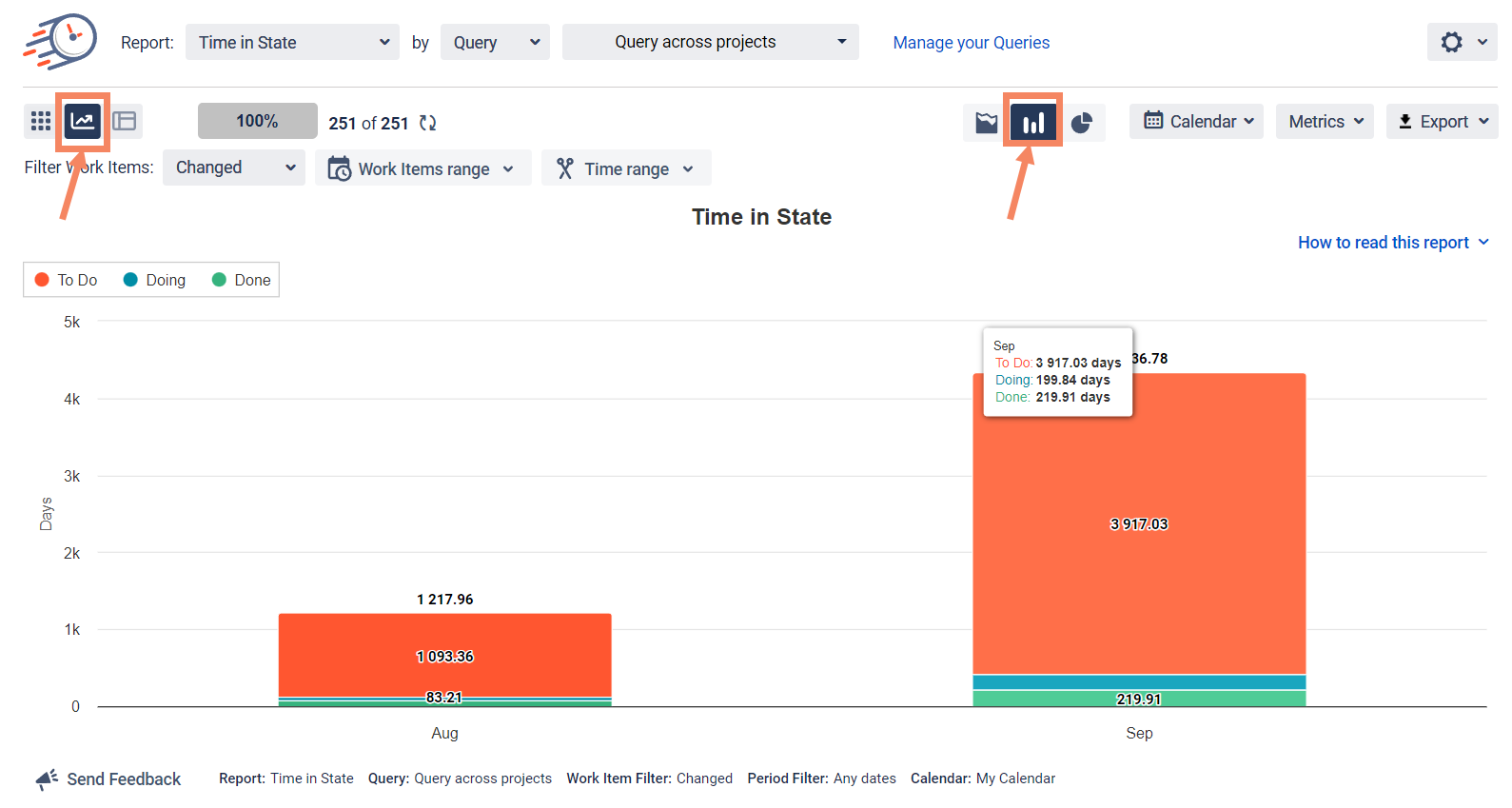
Types of Charts
The add-on supports three types of graphs: Pie, Bar, and Area Charts.
Configurations
To configure data at Chart Reports you can use the same features as at Grid Reports.
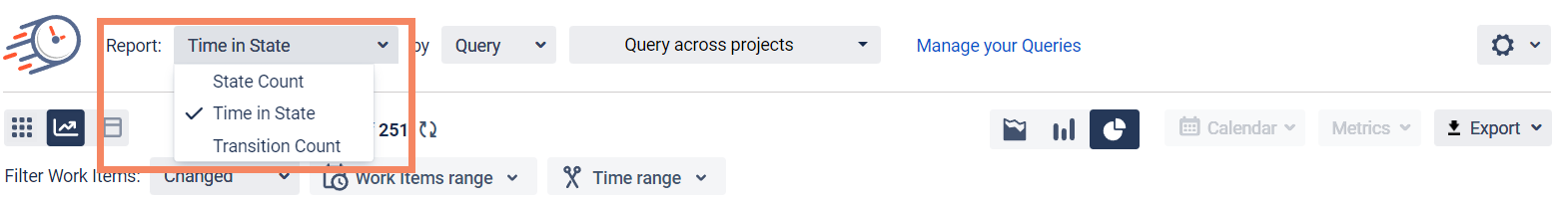
You can choose different kinds of reports to monitor data visually.
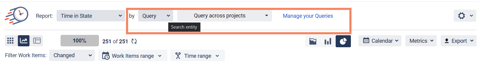
Filter the data by Query.
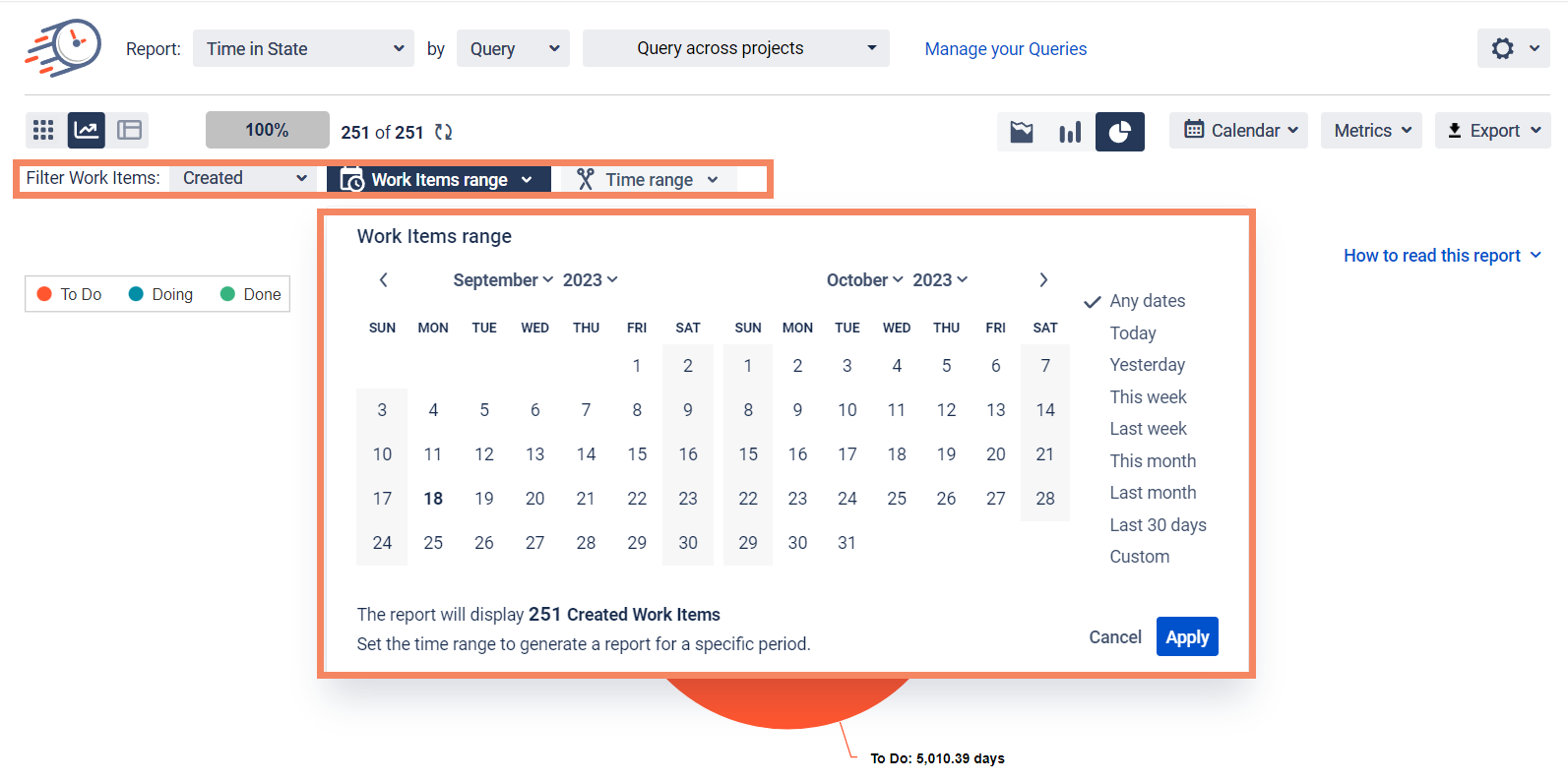
Use Date ranges function to customize your report timeframes.
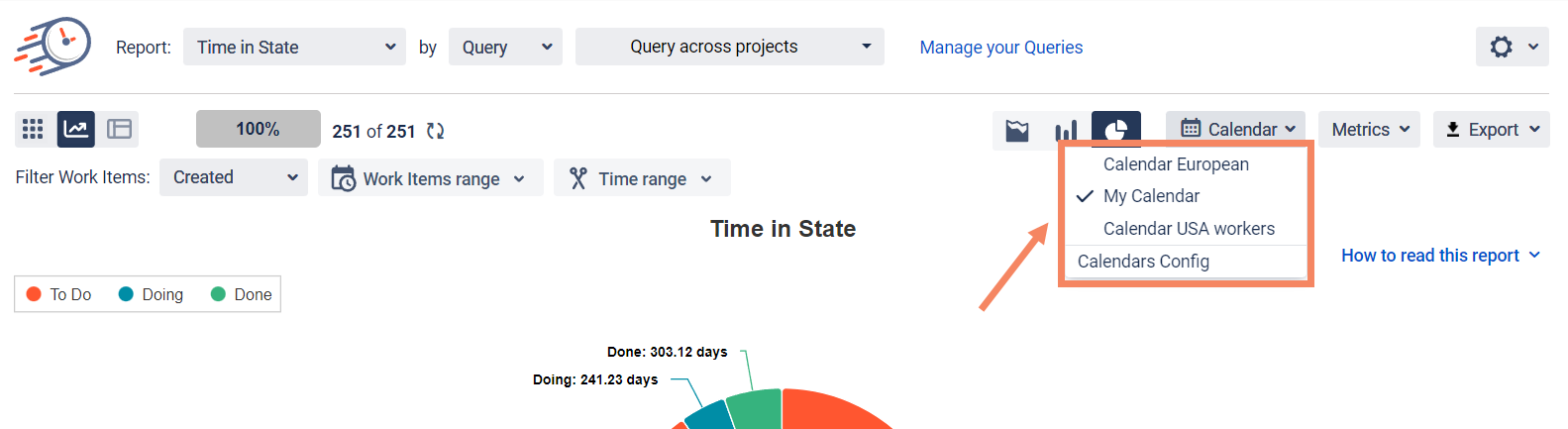
Select Calendar to choose a custom calendar you've added previously or a default 24/7 one.
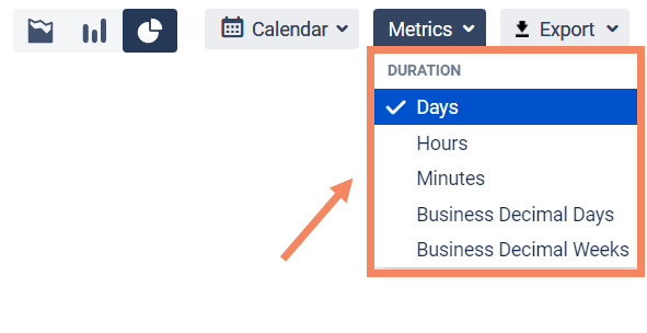
To configure Metrics at Chart Reports, choose Duration and its Period.
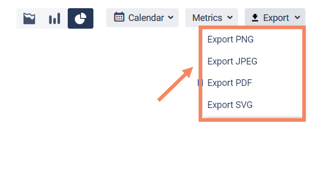
Save and present your Chart Reports exporting them to PNG, JPEG, PDF, SVG files.
If you need help or want to ask questions, please contact SaaSJet Support or email us at support@saasjet.atlassian.net
Haven't used this add-on yet? Try it now >>>Time in State for Azure DevOps