
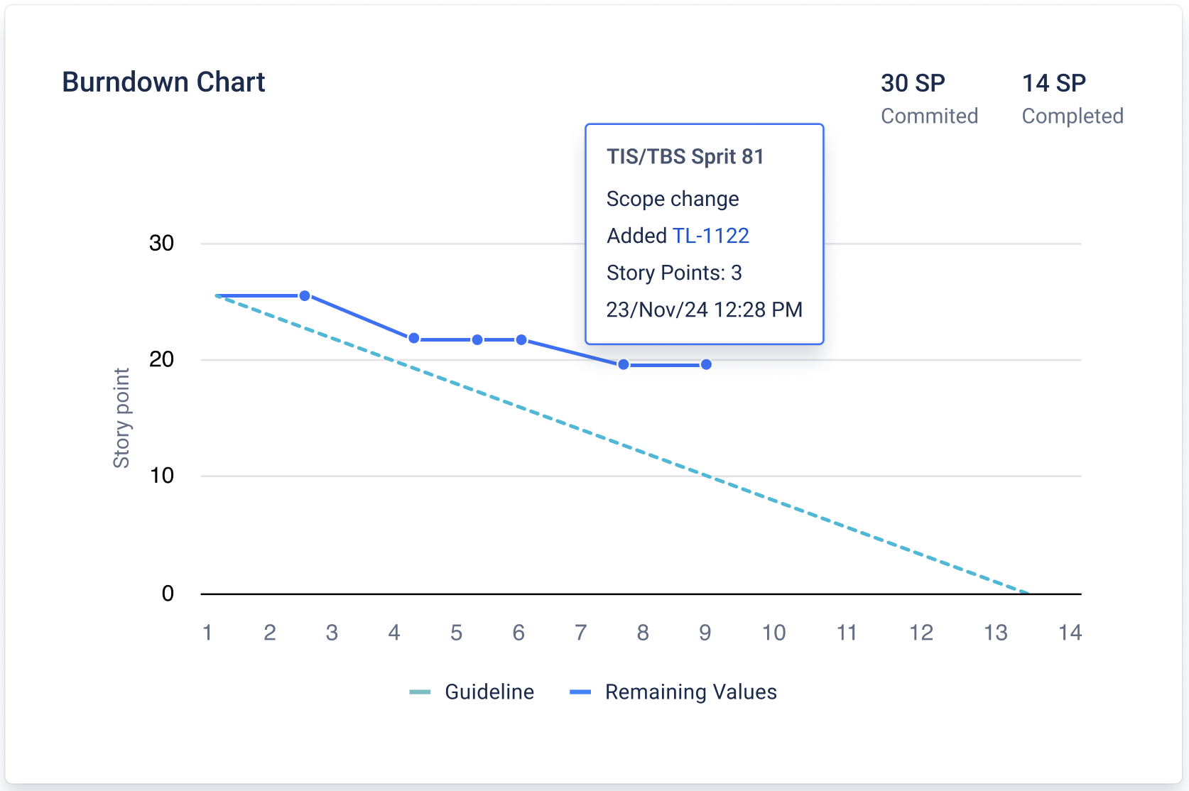
A burndown chart is a simple way to see whether your sprint is on track.
It answers questions like:
-
Are we finishing work fast enough to meet the sprint goal?
-
Did we add more work during the sprint?
-
Why does “work remaining” suddenly go up or down?
The main idea
At the start of the sprint, the team has a certain amount of work planned (your commitment).mAs the sprint goes on, that amount should go down as issues get completed.
-
If the line is going down steadily, you’re likely on track.
-
If it stays flat for too long, the team may not be finishing work yet.
-
If it goes up, it usually means new work was added.
How to read the chart
X-axis (time)
Shows the sprint timeline:
-
usually days
-
if the sprint is very short, it switches to hours
-
if it’s extremely short, it switches to minutes
So the chart always matches the real sprint duration.
Y-axis (work remaining)
Shows “how much work is still left”, based on the method you choose:
-
Story Points
-
Original Time
-
Work Item Count
Example:
-
If you choose Story Points, the chart shows how many story points are still not done.
-
If you choose Work Item Count, it shows how many issues are still not done.
What makes the line move
The burndown changes when something in the sprint changes:
✅ Issue added to the sprint → line goes up
More work was added, so the remaining work increases.
✅ Issue removed from the sprint → line goes down
Work was taken out of scope, so the remaining work decreases.
✅ Issue completed → line goes down
Work got finished, so the remaining work decreases.
If none of these things happen for a while, the line stays flat.
Actual vs Forecast lines
Actual line
Shows what really happened so far:
-
starts at the sprint’s initial commitment
-
updates up to today / current time
-
moves up/down when scope changes or issues are completed
Forecast line
Shows the “ideal path” to finish on time:
-
a straight line from the initial commitment
-
to the planned end of the sprint
Think of it as a simple target to compare against.
What “good” and “risky” patterns look like
-
Actual line is close to the forecast line: sprint is generally on track
-
Actual line is above the forecast line: you may be behind (too much work remaining)
-
Actual line goes up often: scope is changing a lot (new work added mid-sprint)
-
Actual line stays flat for long periods: work may be in progress but not reaching “Done”
If you need help or want to ask questions, please contact SaaSJet Support or email us at support@saasjet.atlassian.net
Haven’t worked with the add-on yet? Give it a try