Power BI Dashboard Template for Support Teams Using Time in Status App Data
We've created a dashboard template for Support team reporting based on data received and calculated using the Time in Status app. This template is a valuable resource for anyone interested in creating comprehensive reports in Power BI.
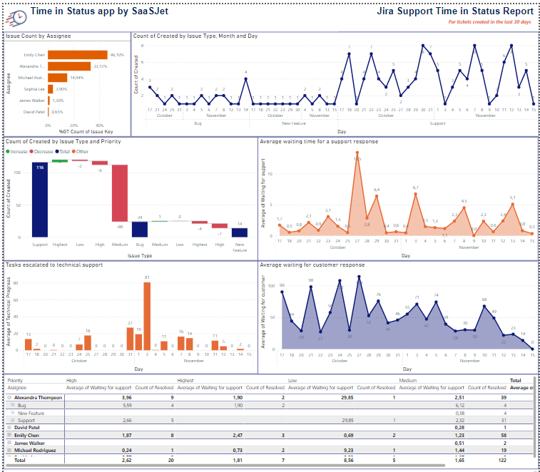
Let's take a look at how to use it.
First, select the task scope in the Time in Status app, save the preset, and generate the JSON Data Feed Link. Learn more.
Download the dashboard template and open it in Power BI.
Add your Data Feed using the Get Data option in the upper right corner.
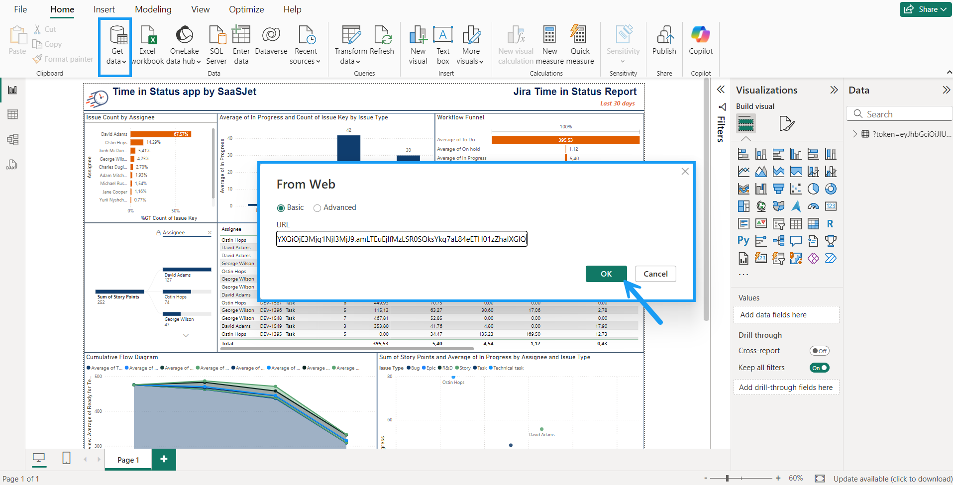
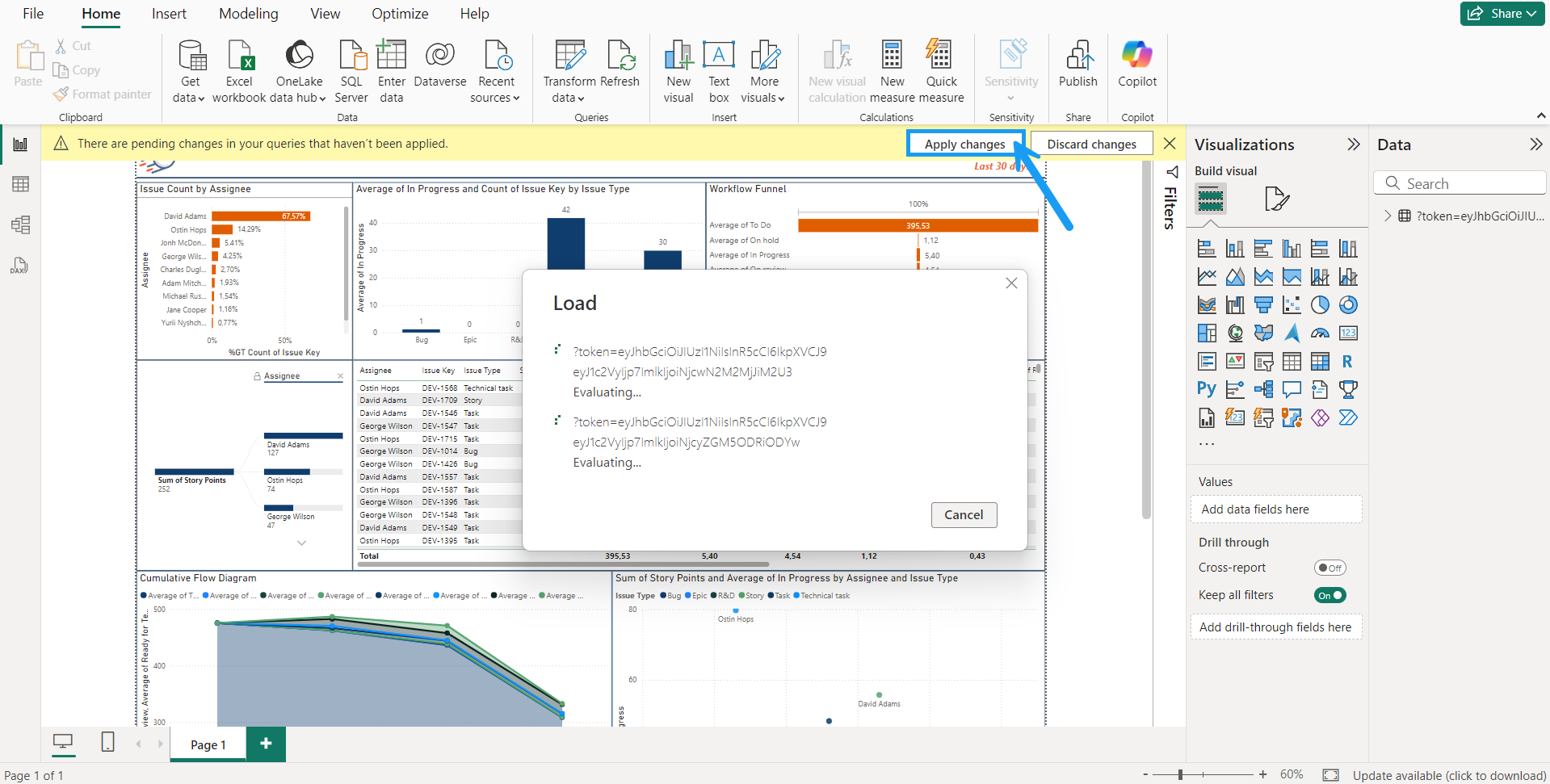
Click Apply and wait for the Data Feed to connect as a data source to the template.
Remove the default data source that was originally attached to the dashboard to avoid confusion between data.
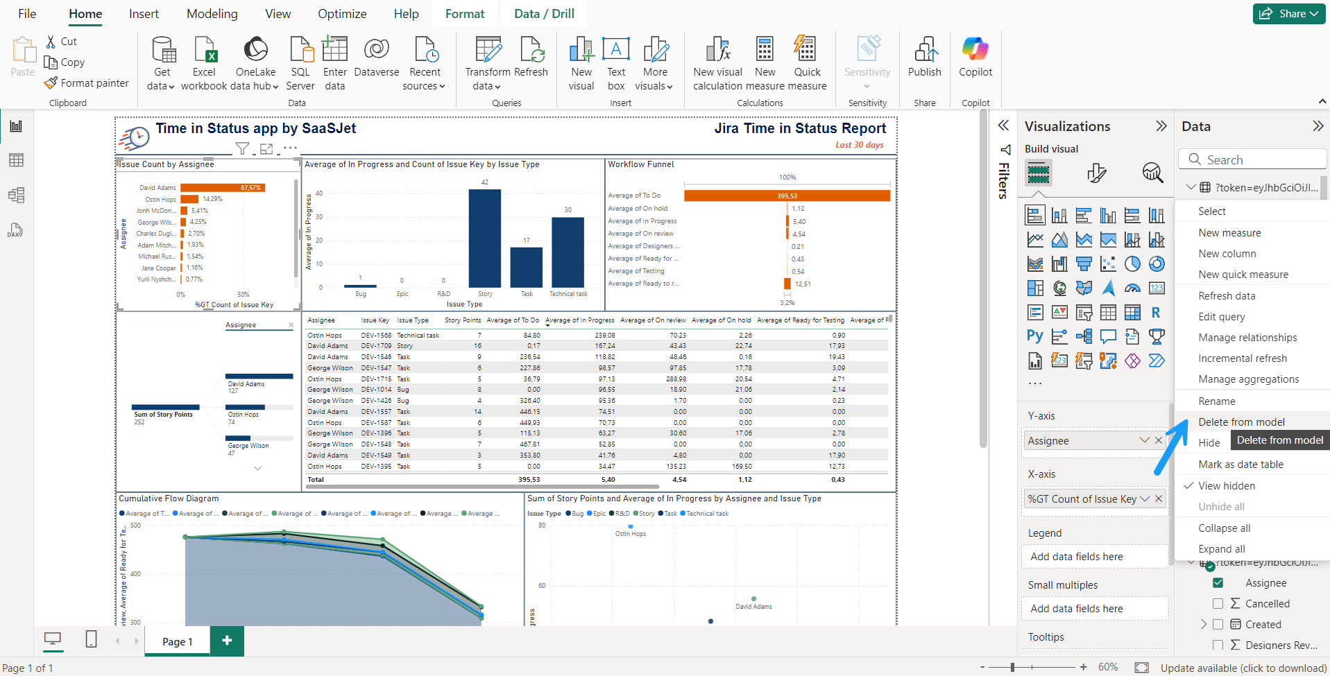
The gadgets will disappear, but their settings will remain. Next, look at each chart and how to reconfigure them for your data.
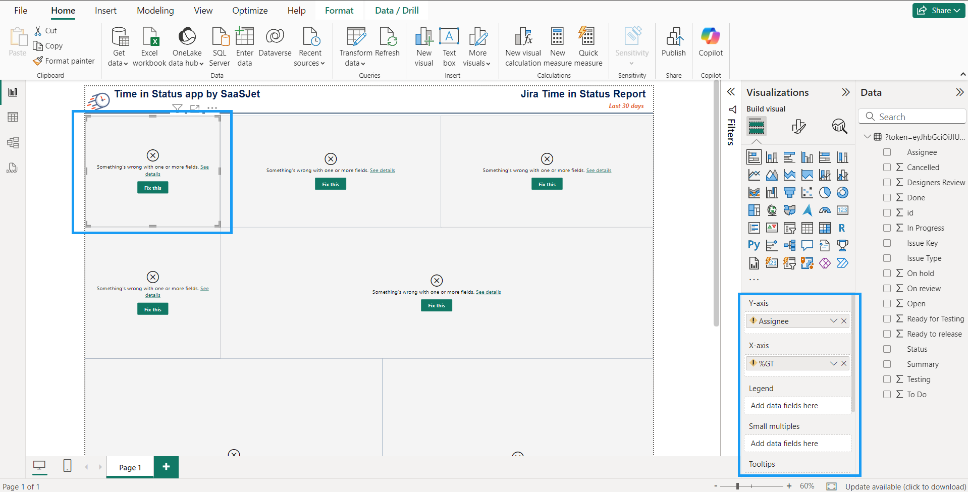
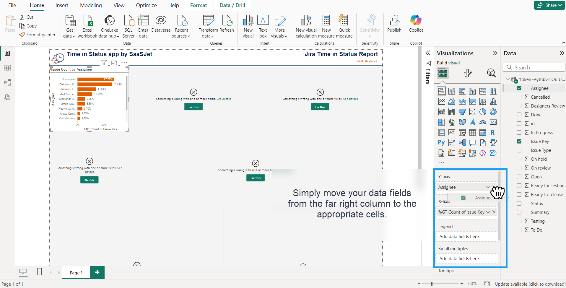
Issue Count by Assignee
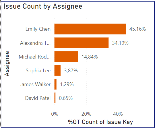
The chart visually represents the number of support issues assigned to each team member. This chart is a valuable tool for understanding workload distribution, identifying potential imbalances, and ensuring that support tasks are allocated fairly and efficiently.
Count of Created by Issue Type, Month, and Day

Chart provides a detailed breakdown of the new issues created, categorized by issue type, month, and day. This chart helps you understand the volume and distribution of new issues over time, enabling you to identify trends, plan resources, and optimize your workflow.
Waterfall Chart: New Issues by Type and Priority
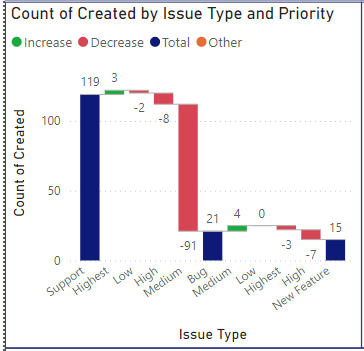
The Waterfall Chart: New Issues by Type and Priority visually represents the cumulative count of new issues created, categorized by issue type and priority. This chart helps you understand the volume and urgency of new issues, enabling you to prioritize tasks, allocate resources effectively, and optimize your workflow.
Average Waiting Time for a Support Response
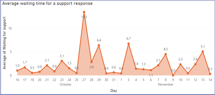
Metric clearly indicates how long customers or users typically wait for a response from your support team. This metric is crucial for understanding and improving customer satisfaction and optimizing support processes.
Tasks Escalated to Technical Support
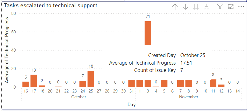
Metric indicates how many tasks or issues have been escalated to the technical support team. This metric is crucial for understanding the complexity and volume of issues that require advanced technical assistance and optimizing your support processes.
Average Waiting Time for Customer Response
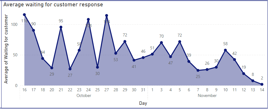
The Average Waiting Time for Customer Response metric clearly indicates how long your support team typically waits for a response from customers. This metric is crucial for understanding and improving the efficiency of your support processes and optimizing customer communication.
Summary Table by Assignee and Time in Status with Breakdown by Priorities and Number of Resolved Tasks

The pivot table provides a comprehensive overview of your team members' performance and workload distribution. This table helps you understand how tasks are allocated, how long they spend in each status, and how many tasks are resolved, all broken down by priority levels.
If you need help or want to ask questions, please contact SaaSJet Support or email us at support@saasjet.atlassian.net
Haven't used this add-on yet? Try it now!