
Jira Histogram Chart: Visualizing Time Distribution based on Time Metric
This guide will help you navigate the Histogram Chart, understand its components, customize intervals, and interpret the data effectively. Use these insights to make informed decisions and improve project outcomes.
1. Accessing the Histogram Chart
1.1 Locate the Chart Icon:
Find and click on the chart icon in the switcher panel to open the Histogram Chart.

2. Understanding the Histogram Chart
2.1 2.1 Automatic Histogram Formation (Single Time Metric)
If your project is configured with only one time metric, the histogram will automatically display work item distribution over time.
2.2 Selecting a Time Metric (Multiple Time Metrics)
If multiple time metrics exist:
Open the Time metric dropdown.
Select the metric you want to analyze (e.g.,
Cycle time,Review time).The chart will refresh to display data for the selected metric.
If you don’t have a metric yet, click "Create Time metric" to configure one.
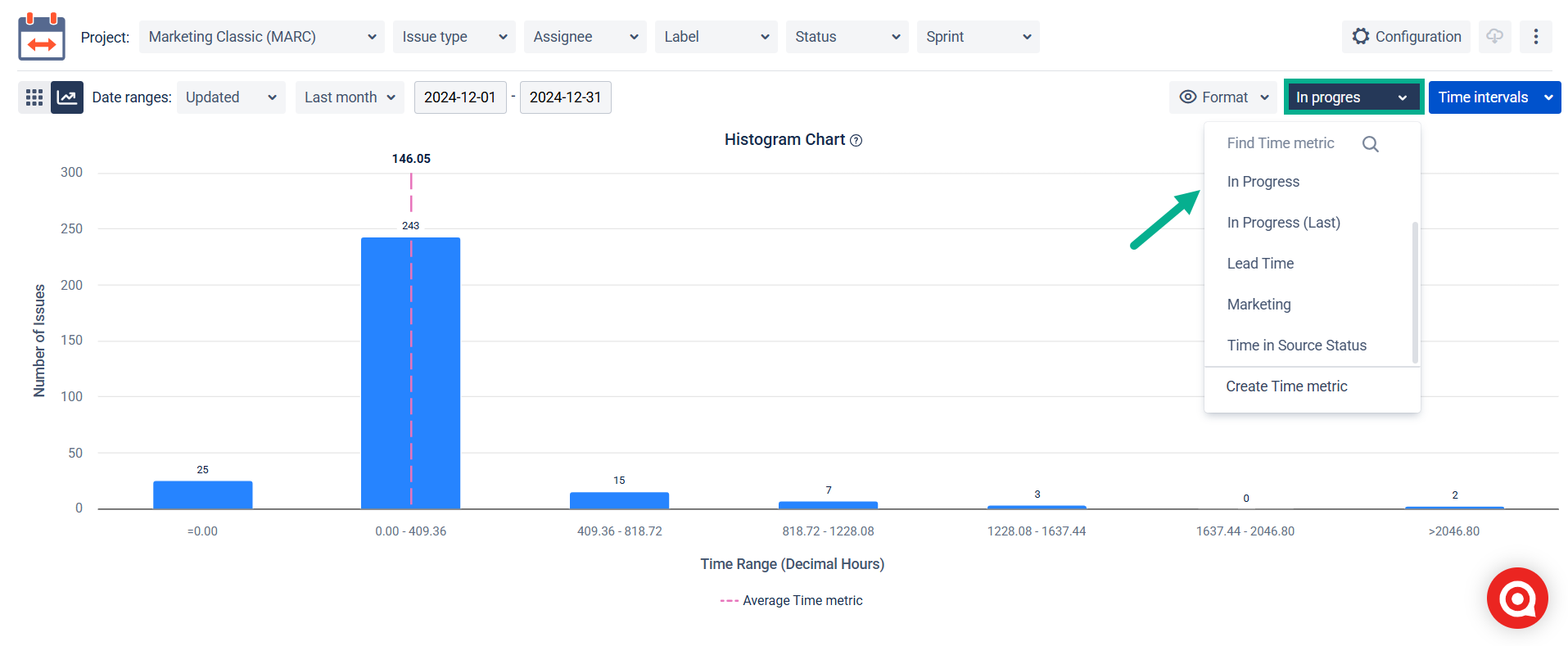
If you do not have a Time metric set up, use the “Create Time metric” button in the dropdown.
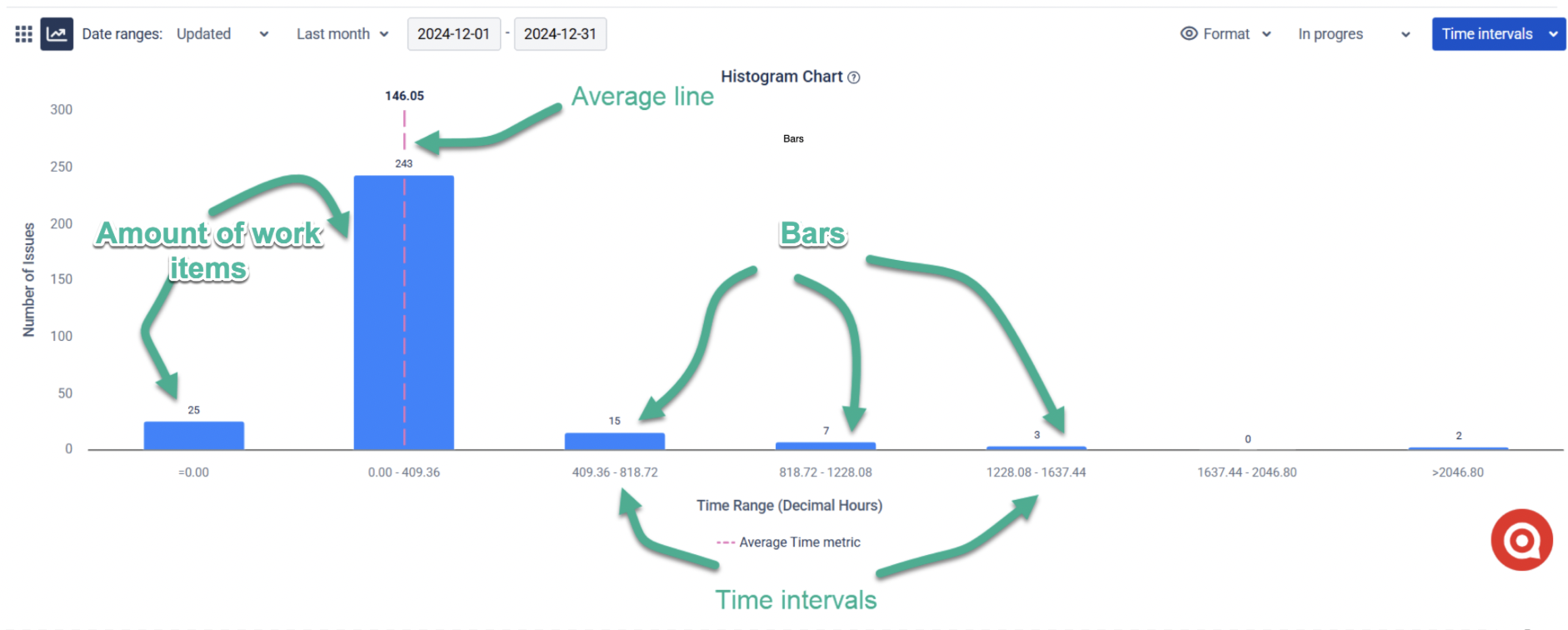
2.3 Key Components of the Histogram Chart
Bars: Show how many work items fall into specific time intervals.
Time Interval: The step used to build the bins (bars). For example, every 2 days or every 5 hours.
Format Button: Lets you choose whether the time interval is displayed in hours, days, weeks, or minutes.
Min and Max: Define the start and end of the total time range — the chart automatically splits it into equal intervals (bins).
Short intervals = More detail (zoom-in on variation)
Wide intervals = Overview of trends (zoom-out for big picture)
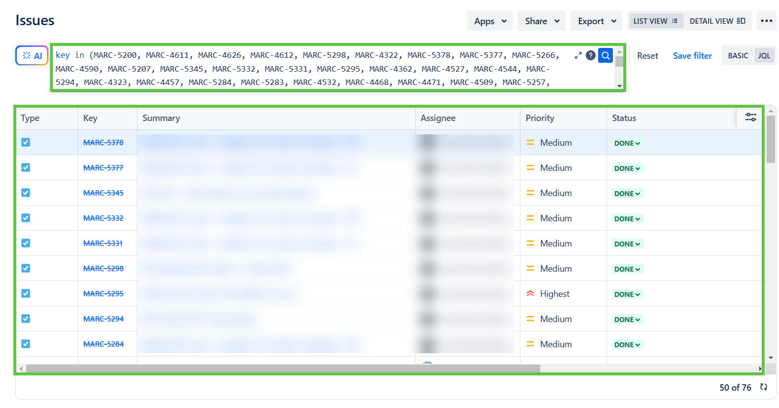
2.4 Work Item Drill-Down
You can see all the tasks included in this selection by clicking on the time interval value below any bin.
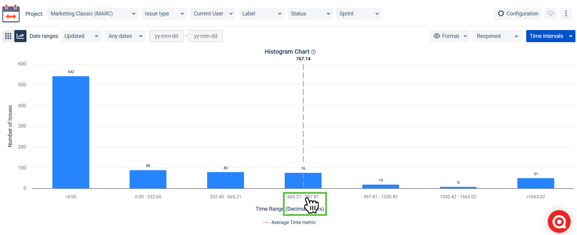
So, you click on the interval, and a new tab will open for you in the Jira search with JQL, which will pull out all the tasks that belong to this or that bin.
3. Customizing the Histogram Chart
3.1 Adjusting Time Intervals
You can modify intervals to suit your analysis better needs:
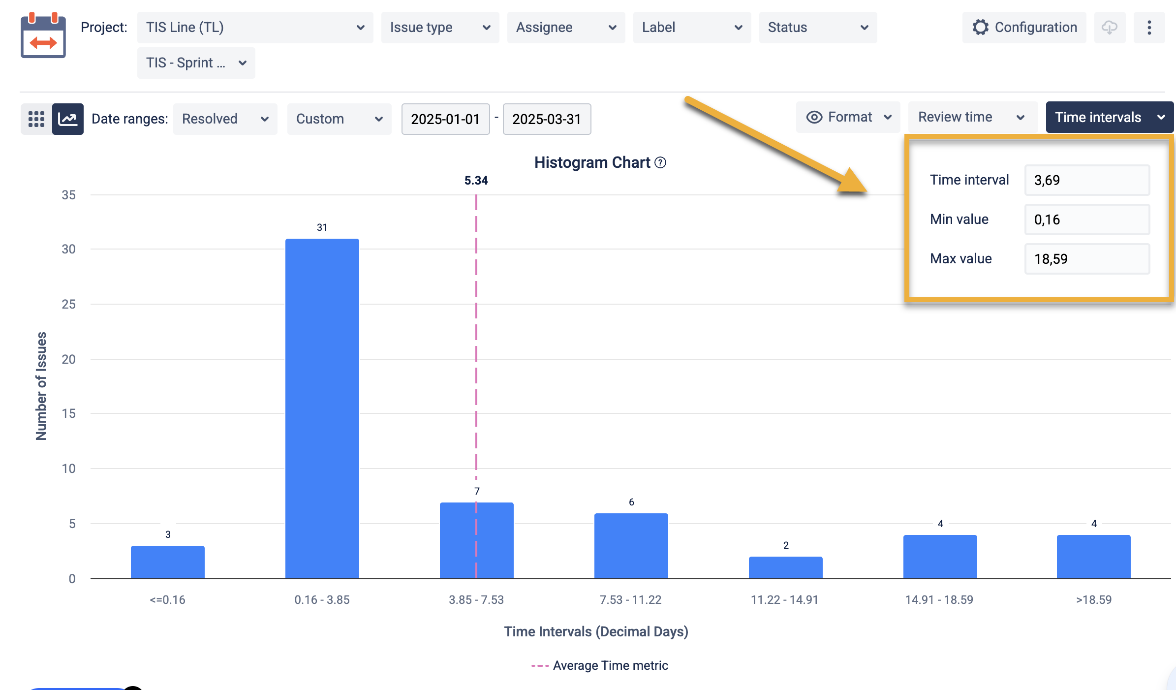
Time Interval: Define the number of bins (up to 50).
This determines the number of bins displayed in the histogram. A "bar" is essentially a grouping range for your data. You can set up to 50 bars, each representing a specific time interval. For example, if your data spans 50 days and you set 10 bins, each bar will represent 5 days.
Min Value: Sets the endpoint of the leftmost bin.
This is the smallest value included in the leftmost bin. It defines where the data grouping starts. Example: If your min value is set to 0, the first bin will group all work items with a time metric of 0 or slightly above.
Max Value: Sets the starting point of the rightmost bin.
This is the largest value included in the rightmost bin. It defines where the data grouping ends. Example: If the max value is set to 50, the last bin will include all work items with a time metric of 50 or less.
3.2 Default Interval Calculation
By default, intervals are calculated as:
(Max − min) ÷ 5 This ensures a balanced representation of your data.
4. Interpreting the Histogram Chart
To interpret the chart effectively:
Bars (Bins): Each bar groups work items by how long they took to complete the selected time metric.
X-Axis (Time Interval): Indicates the time range (in decimal hours, days, etc.)
Y-Axis (Work Item Count): Indicates how many work items fall into each range.
Average Line: The dotted pink line shows the average duration across all work items. Use this as a reference to spot under/overperforming groups.
Tips for Analysis:
Identify Trends:
Examine where most work items fall. This could reveal common processing times or areas needing improvement.
Spot Outliers:
Look for bins with unusually high or low counts. These could represent anomalies or areas requiring further investigation.
Compare Metrics:
If using multiple time metrics, compare histograms to identify differences in processing times across various workflows or teams.
Review the Average Line:
Use the average line as a benchmark to determine whether most work items align with typical processing times or deviate significantly.
If you need help or want to ask questions, please contact us through SaaSJet Support or via email support@saasjet.atlassian.net
Haven't used this add-on yet, then try it now!