
Creating effective forms shouldn't require technical expertise or hours of setup. With Smart Forms for Jira, you can build professional, functional forms using our intuitive drag-and-drop builder that puts all the power at your fingertips. Whether you need a simple feedback form or a complex multi-step workflow, our form builder adapts to your needs.
Getting Started with Form Builder
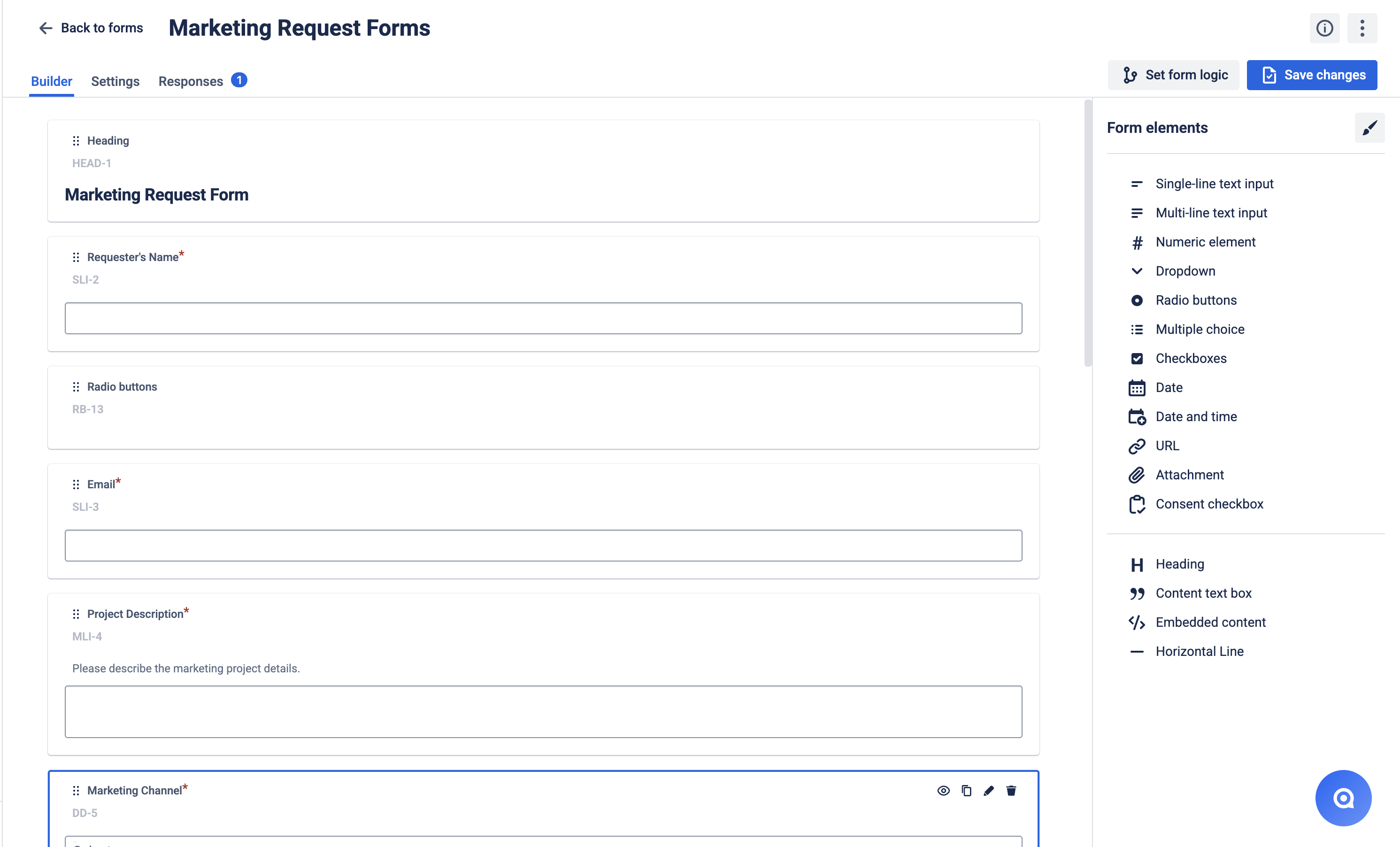
The form builder operates on a simple "Drag → Drop → Configure" workflow:
📌 Select elements from the comprehensive element library
📌 Drag and drop them into your form layout
📌 Configure settings for validation, logic, and appearance
🔑 Unique Element Keys: Each form and content element automatically receives a unique key (like "SLI-1", "DD-2"), making it easier to:
-
Set up form logic when elements have identical labels
-
Reference responses in customize submission messages using ${element-key} format
Form Elements
Form elements are the core data collection components of your forms. Each serves a specific purpose for gathering structured information.
Text Input Elements
📝 Single-line text input
-
Perfect for: Names, phone numbers, job titles, short responses
-
Features: Character limits, placeholder text, validation
📄 Multi-line text input
-
Perfect for: Comments, descriptions, detailed feedback
-
Features: Expandable text area, character limits
🔗 URL element
-
Perfect for: Website addresses, social media profiles, portfolio links
-
Features: Built-in URL validation, clickable preview
🔢 Numeric element
-
Perfect for: Quantities, ages, prices, ratings, scores
-
Features: Number validation, min/max ranges
Selection Elements
📋 Dropdown
-
Perfect for: Single selection from many options (departments, priorities)
-
Features: Search functionality, Jira field population
☑️ Multi choice
-
Perfect for: Multiple selections from dropdown format
-
Features: Multiple selection dropdown, option limits
✅ Checkboxes
-
Perfect for: Multiple selections with visible options (under 10 items)
-
Features: Horizontal or vertical layout, auto-arranges vertically for 5+ options, "Other" option for custom text responses
🔘 Radio buttons
-
Perfect for: Single selection with all options visible (2-5 options)
-
Features: Horizontal or vertical layout, auto-arranges vertically for 5+ options, "Other" option for custom text responses
.png?cb=35a9e2d81340fe203d562ec80892fd26)
Specialized Elements
📅 Date picker
-
Perfect for: Deadlines, hire dates, appointments
-
Features: Calendar interface, matches Jira date format
🕐 Date and Time picker
-
Perfect for: Meeting times, event scheduling
-
Features: 30-minute intervals with manual override
📎 Attachment
-
Perfect for: Documents, receipts, images, contracts
-
Features: Multiple file upload, 100MB max size, file type validation
✅ Consent checkbox
-
Perfect for: Terms agreement, privacy policy, GDPR compliance
-
Features: Required acceptance, policy linking
Content Elements
Content elements help structure and guide users through your forms without collecting data.
📑 Heading
-
Purpose: Section organization and visual hierarchy
-
Pro tip: Provides hover hints to users for all elements below until the next heading
-
Features: Available in form builder and all shared forms
📝 Content text box
-
Purpose: Instructions, explanations, helpful tips for form completion
-
Rich formatting options:
-
Text formatting: Bold, Italic, Underline, Clear Formatting
-
Lists: Bullet points and numbered lists
-
Interactive elements: Links, Emojis, Dates, Dividers
-
Advanced: Info panels, Quotes, Tables, Status indicators
-
🎬 Embedded content
-
Purpose: Integrate multimedia content directly into forms
-
Supported content: YouTube videos, images, Google Drive files
-
Features: Direct URL embedding, display scale setting up
➖ Horizontal Line
-
Purpose: Visual separation between form sections
-
Benefits: Improves readability and creates organized, professional-looking forms
-
Usage: Perfect for grouping related elements or creating distinct sections
Element Settings & Configuration
Core Settings Available for All Elements
🏷️ Label & Description
-
Label: Clear, descriptive text telling users what information to provide
-
Description: Additional context and instructions (supports line breaks)
⚠️ Response Requirements
-
Required fields: Users must complete before submission
-
Optional fields: Users can skip without blocking form submission
-
Visual indicator: Required fields show clear marking to users
Advanced Configuration Options
📏 Character Limits (Text Elements)
-
Min/Max characters: Enforce specific length constraints
-
Error handling: Automatic validation with helpful error messages
-
Use cases: Ensure consistent data quality and prevent extremely short/long responses
💭 Help Text & Placeholders
-
Help text: Additional guidance alongside form elements
-
Placeholder: Example text that disappears when users start typing
-
Related URL: Link to additional resources or detailed instructions
🎯 Default Response
-
Pre-filled values: Set default answers that appear automatically in form fields
-
Hidden field integration: Can be used in hidden fields for automatic data collection
-
Workflow automation: When combined with "Create New Issue" mapping, hidden fields with default responses automatically populate work item fields without user input
-
User experience: Visible fields show defaults users can modify; hidden fields collect data invisibly
-
Use cases: Automatic categorization, tracking sources, workflow routing
🔗 Jira Field Integration
-
Populate from Jira: Auto-fill options from existing Jira field values
-
Supported fields: Priority, Components, Labels, User fields, and more
Form Logic & Conditional Display
🧠 Smart Form Behavior
-
When/Then logic: Show or hide elements based on user selections
-
Dynamic forms: Adapt questions based on previous responses
-
User experience: Only show relevant fields, reduce form complexity
Example Logic Workflow:
Support Request Form:
├── Issue Type (Dropdown)
│   ├── IF "Bug Report" selected → Show severity and steps fields
│   ├── IF "Feature Request" selected → Show priority and description
│   └── IF "General Question" selected → Show category options
└── Dynamic field display based on selection
Building Your First Form
Step-by-Step Process
-
Plan your form structure
-
Define what information you need to collect
-
Decide on required vs optional fields
-
-
Build your data collection
-
Drag form elements from the library
-
Configure labels and descriptions
-
Set up validation and requirements
-
-
Enhance with logic and validation
-
Add conditional logic for dynamic behavior
-
Set up field validation and character limits
-
Test different user paths through the form
-
-
Preview and refine
-
Test the form flow from user perspective
-
Verify all validation works correctly
-
Form elements settings
|
Form element name |
Response required |
Label |
Description |
Consent text |
Options |
Help text |
Placeholder |
Min/Max Characters |
Related URL |
|
|---|---|---|---|---|---|---|---|---|---|---|
|
Single-line text input |
|
|
|
|
|
|
|
|
|
|
|
Multi-line text input |
|
|
|
|
|
|
|
|
|
|
|
Consent checkbox |
|
|
|
|
|
|
|
|
|
|
|
Dropdown |
|
|
|
|
|
|
|
|
|
|
|
Multiple choice |
|
|
|
|
|
|
|
|
|
|
|
Checkboxes |
|
|
|
|
|
|
|
|
|
|
|
Radio buttons |
|
|
|
|
|
|
|
|
|
|
|
Date |
|
|
|
|
|
|
|
|
|
|
|
Date and Time |
|
|
|
|
|
|
|
|
|
|
|
Attachment |
|
|
|
|
|
|
|
|
|
|
|
URL |
|
|
|
|
|
|
|
|
|
|
|
Numeric element |
|
|
|
|
|
|
|
|
|
|
Questions? Just email us to get an answer support@saasjet.com.
Haven't used this add-on yet, then try it now!