
The Items Count per Status report helps you understand how tasks are distributed across different workflow stages. It’s a great way to monitor bottlenecks, balance workloads, and get a quick overview of your team’s current progress.
🔍 What Does This Report Show?
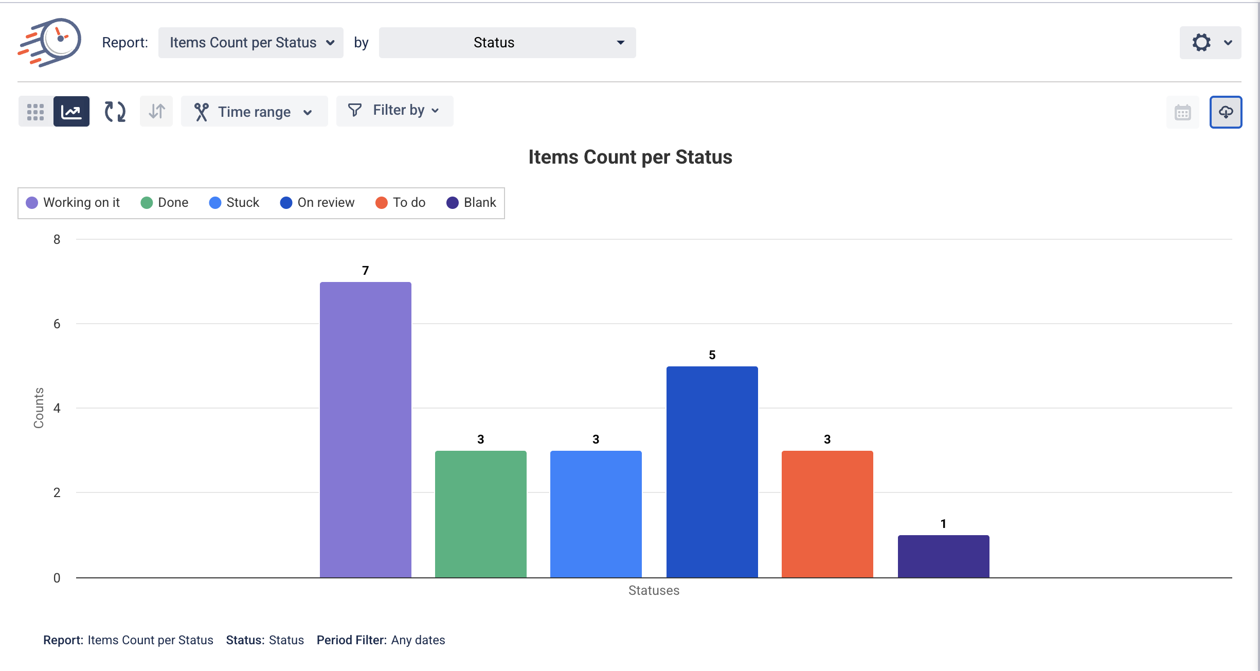
This report displays the number of items (tasks) that are currently in each status of your workflow. For example, you can instantly see how many items are “To Do,” “In Progress,” “Stuck,” or “Done.” The data is visualized in a bar chart for easy analysis.
📌 Why Use This Report?
-
Monitor Workflow Health: Identify statuses that are overloaded or underutilized.
-
Spot Bottlenecks: See where tasks get stuck and act before delays happen.
-
Improve Planning: Use item counts to plan team capacity and task distribution.
-
Quick Snapshot: Great for stand-ups, sprint planning, or retrospectives.
⚙️ How to Use It
-
Go to your Time in Status view.
-
In the Report dropdown, select “Items Count per Status.”
-
Use the “by Status” option to group your data based on the status field.
-
Optionally, filter the report by Time Range or specific People to focus on a segment of your workflow.
-
Hover over the bars in the chart to see the exact item count for each status.
📅 Filter Options
-
Time Range: Select a custom date range to view item status distribution during a specific period.
-
Filter by Person: Focus on tasks assigned to a particular user.
-
Filter by Tags/Boards/Groups (if applicable in your platform): Narrow down the report view based on your structure.
📤 Export Options
You can export the chart in multiple formats for reporting or presentations.
Click the Download icon in the top-right corner of the report to choose:
-
Export PNG – for image use in reports or dashboards
-
Export JPEG – for compact image files
-
Export PDF – for sharing or printing reports
-
Export SVG – for high-quality scalable vector graphics
This makes it easy to integrate visuals into presentations or share insights with your team.
📝 Use Case Example
A product manager uses this report during sprint planning to check how many tasks are currently “On Review”. If the number is unusually high, they may consider allocating more reviewers or adjusting the review process to keep things flowing smoothly.
💡 Pro Tip
Use this report together with Time in Status to get both quantitative and time-based insights — see not just how many tasks are in a status, but also how long they stay there!
If you need help or want to ask questions, please contact SaaSJet Support or email us at support@saasjet.atlassian.net
Haven't used this add-on yet? Try it now >>> Time in Status app for monday.com