
The Pivot Table View enables you to create customized reports and conduct in-depth data analysis.
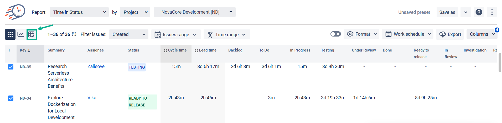
First, switch to the PivotTable view.
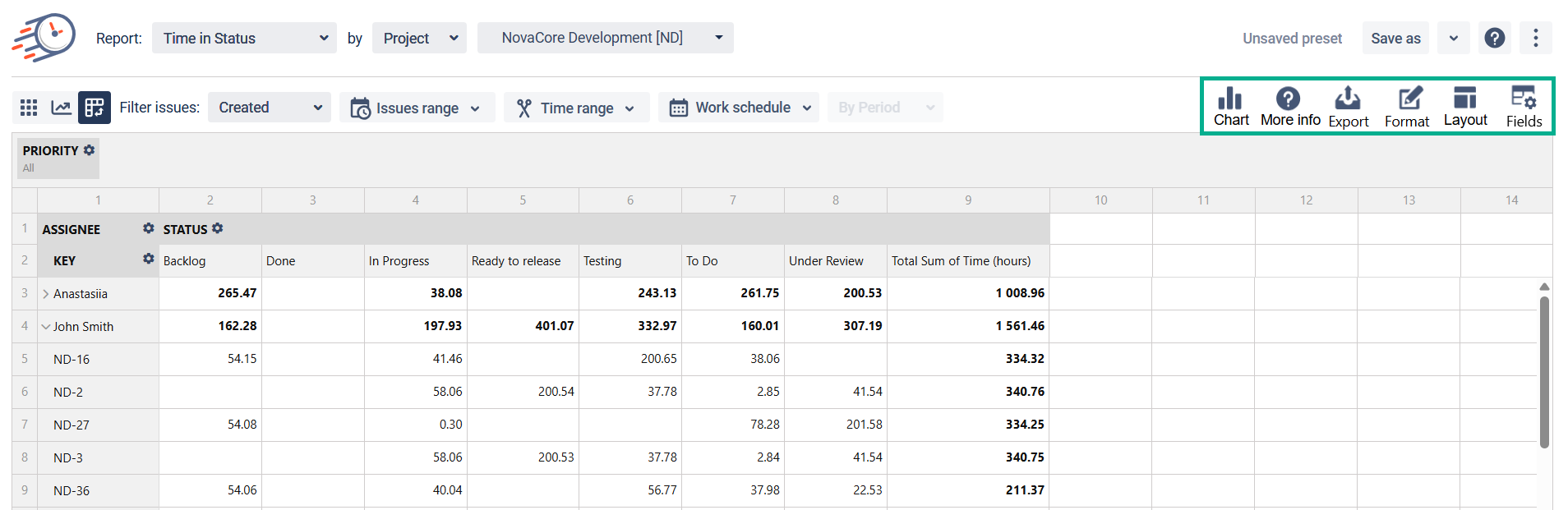
The main functionality of Pivot table view are Fields, Options, Format, Charts and Export.
-
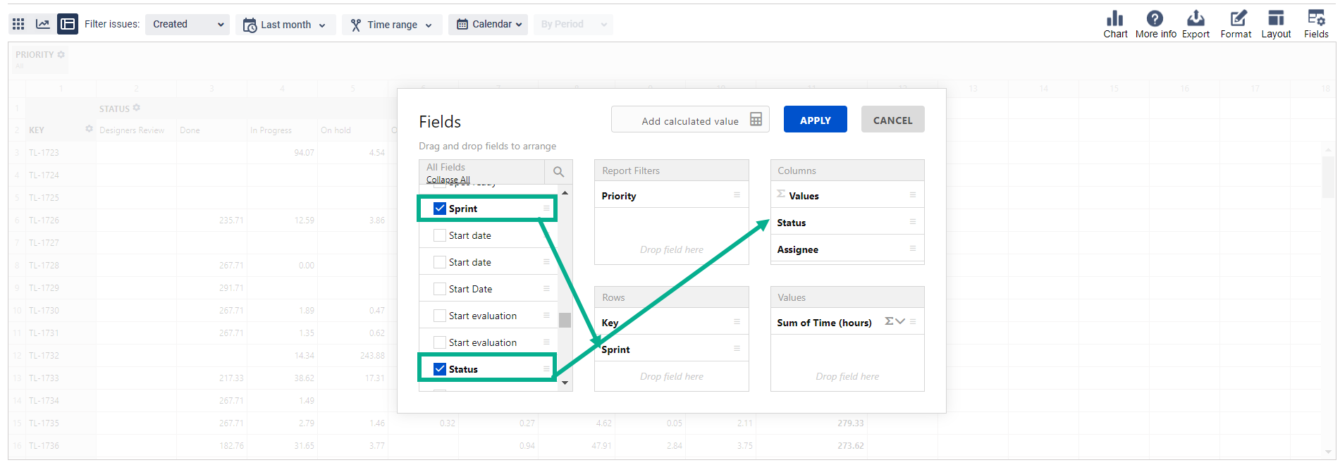
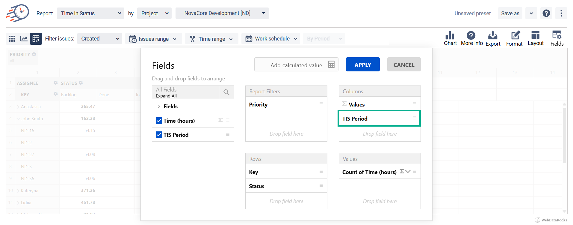
How to add the field to your Pivot table?
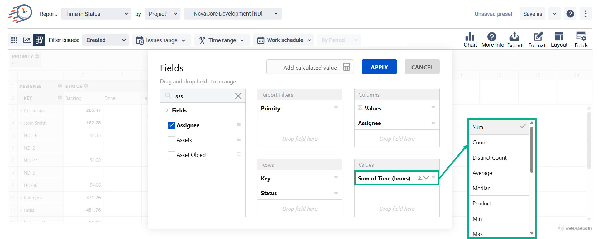
Pivot table fields in the Values area will be displayed as a SUM by default.
You can change the default calculation by clicking the summation sign. Then select the necessary option.
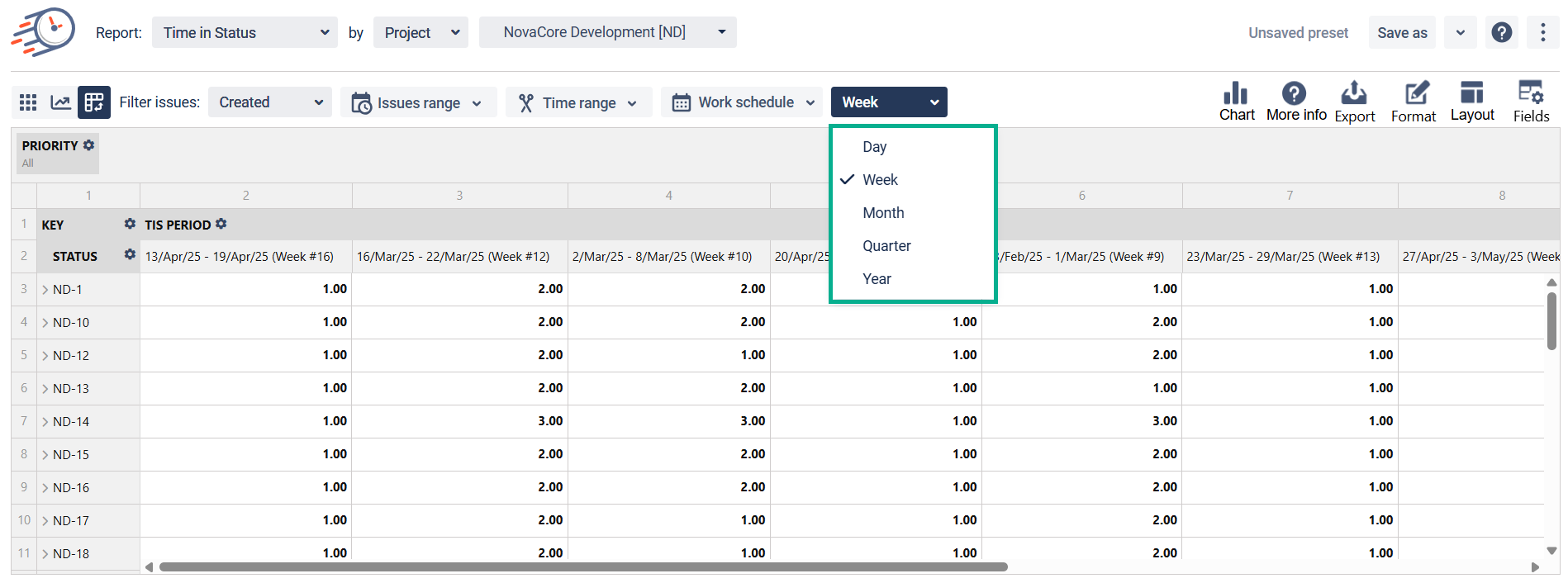
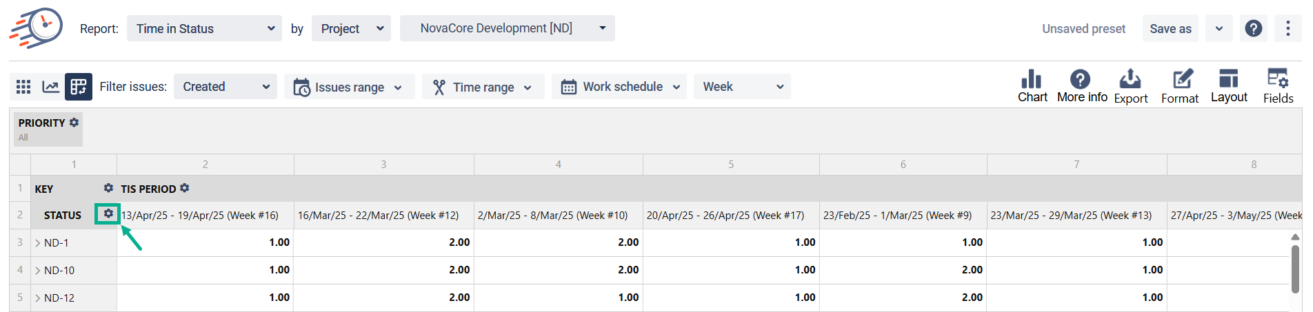
2. Choose the TIS Period option to get the report by different Periods. And choose the period you need.
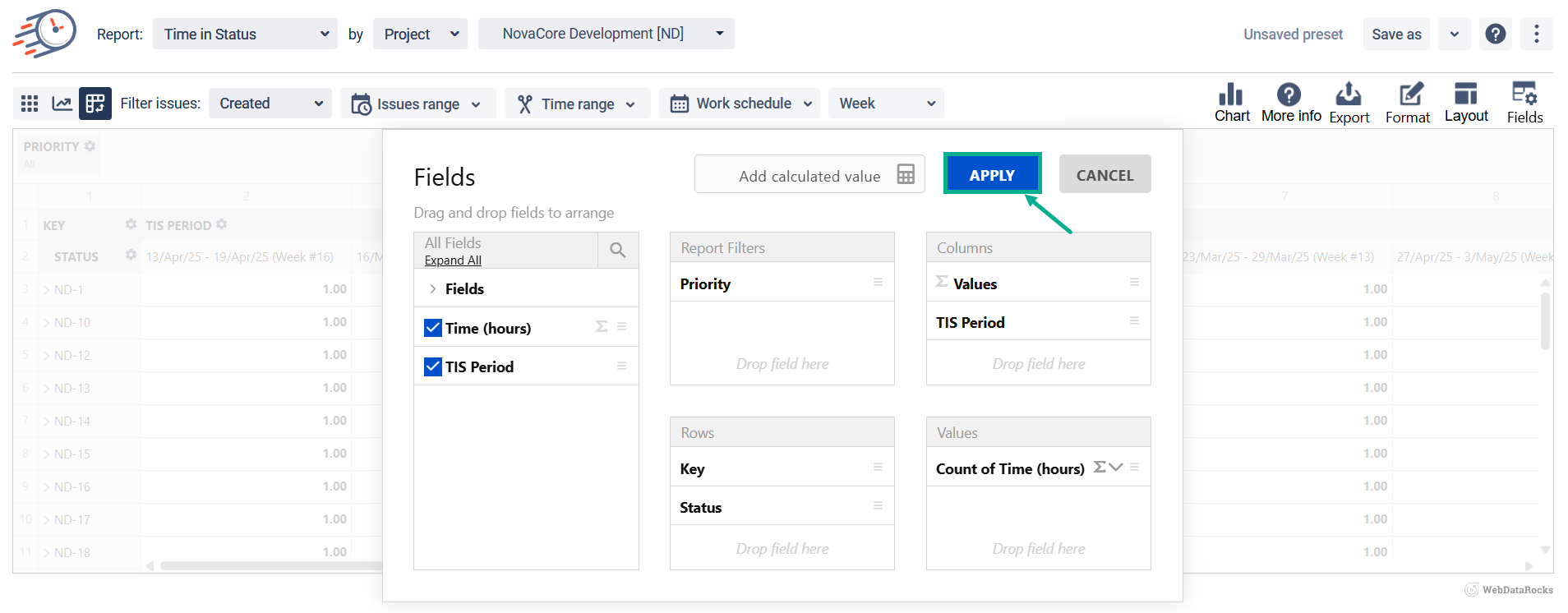
3. After setting all the necessary configurations, click the Apply button.
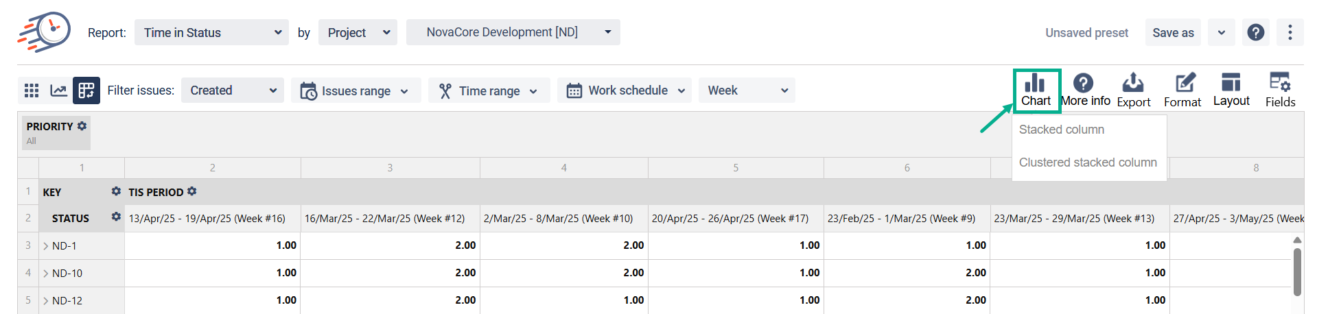
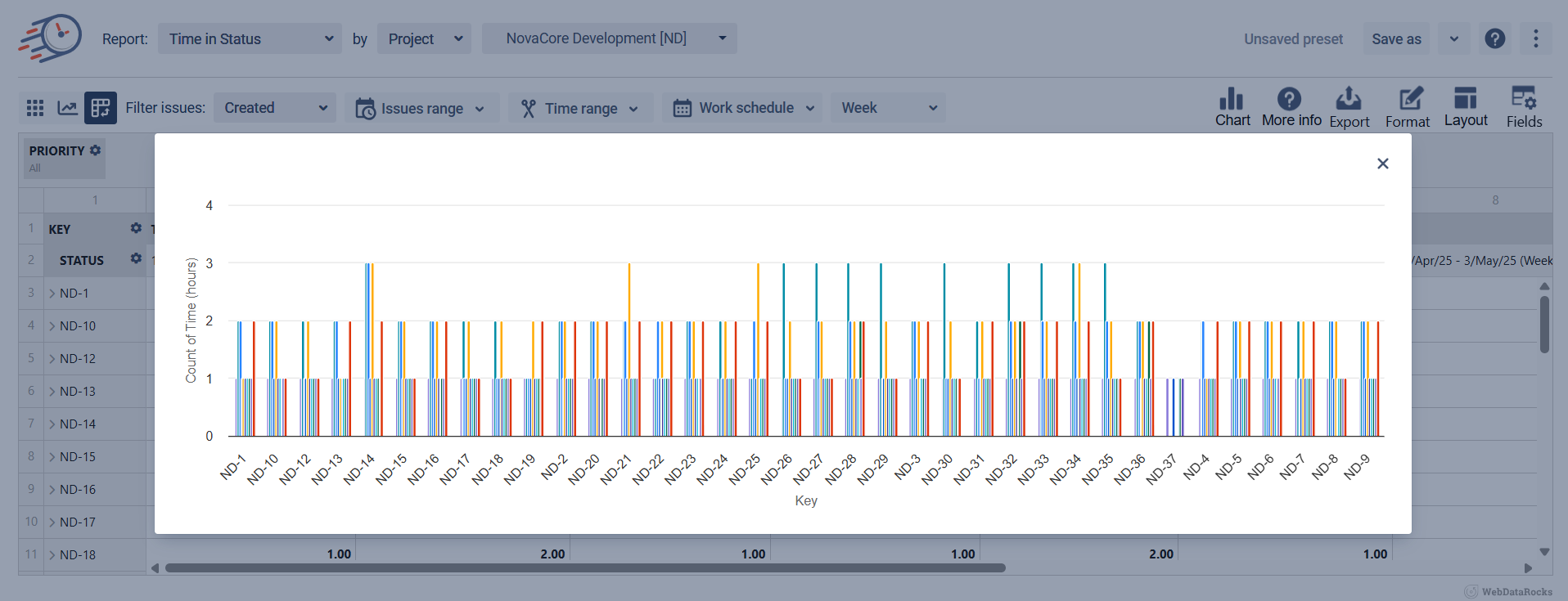
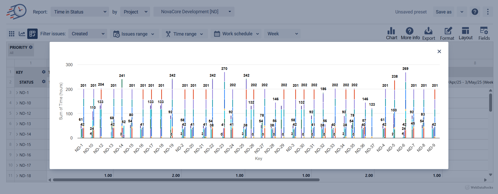
4. You can display any generated report on the Chart view.
You can choose one of two types of data visualization on the chart.
-
Stacked column:
-
Clustered stacked column:
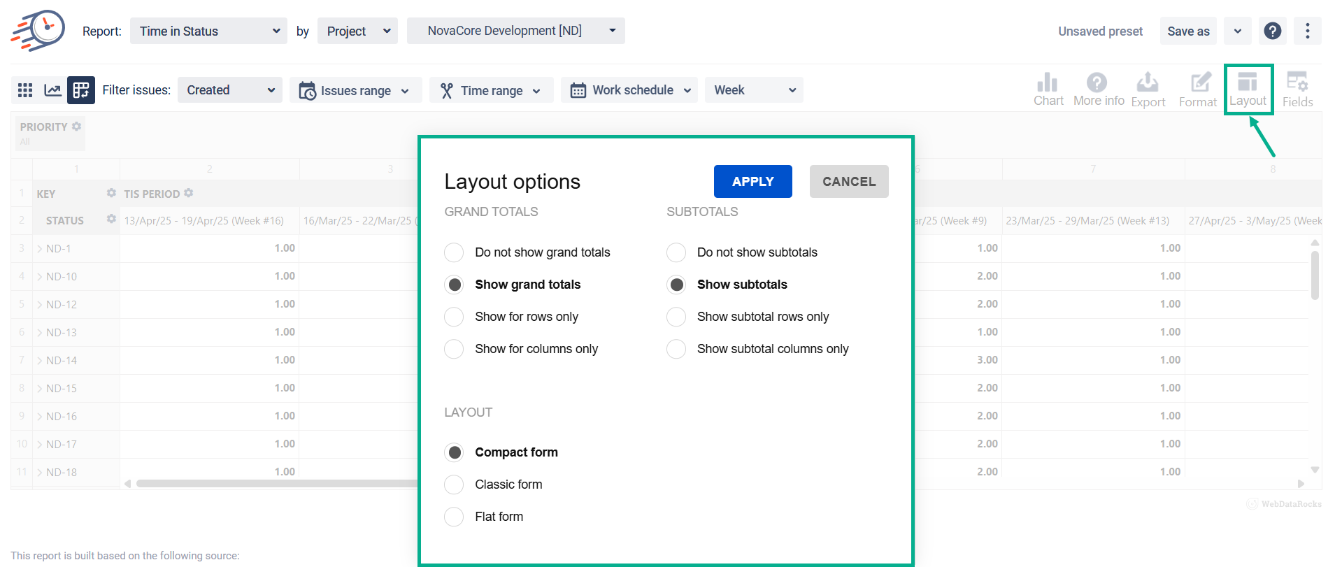
5. Choose the necessary Layout options (Grand totals, Subtotals, Layout).
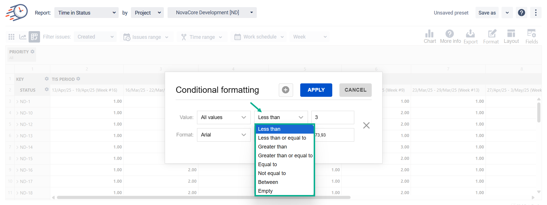
6. Conditional formatting: You can apply it to the entire table and a specific value. This option provides visual cues to help you quickly interpret your data. For example, it’ll clearly show inequality based on the provided criteria.
In the first row, choose the calculated value, the option for condition (less than, greater than, equal to, etc.), and enter the number.
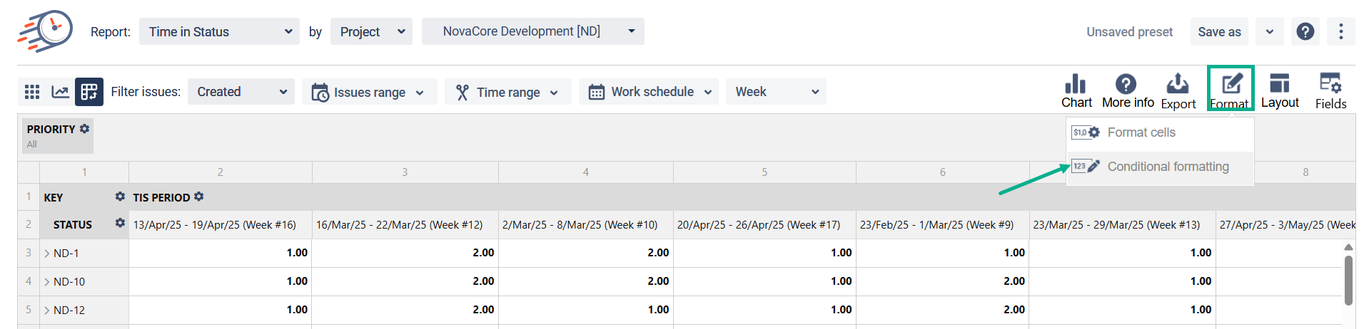
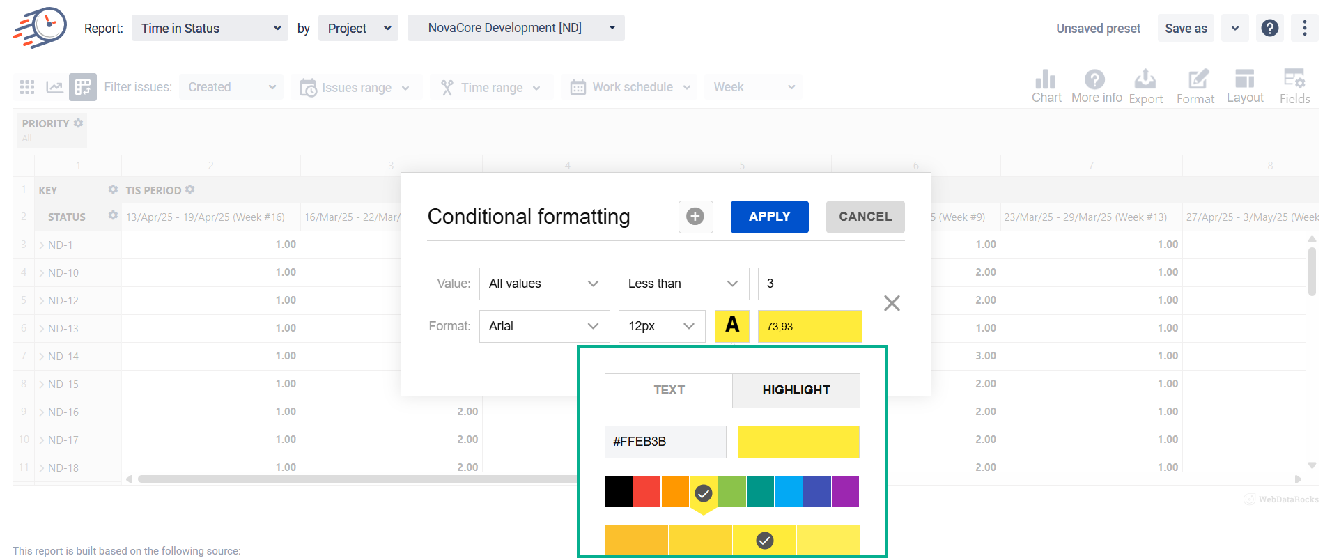
In the second row, you can set the font and font size, text color, or highlight the cell. That will work if the condition in the first raw is true.
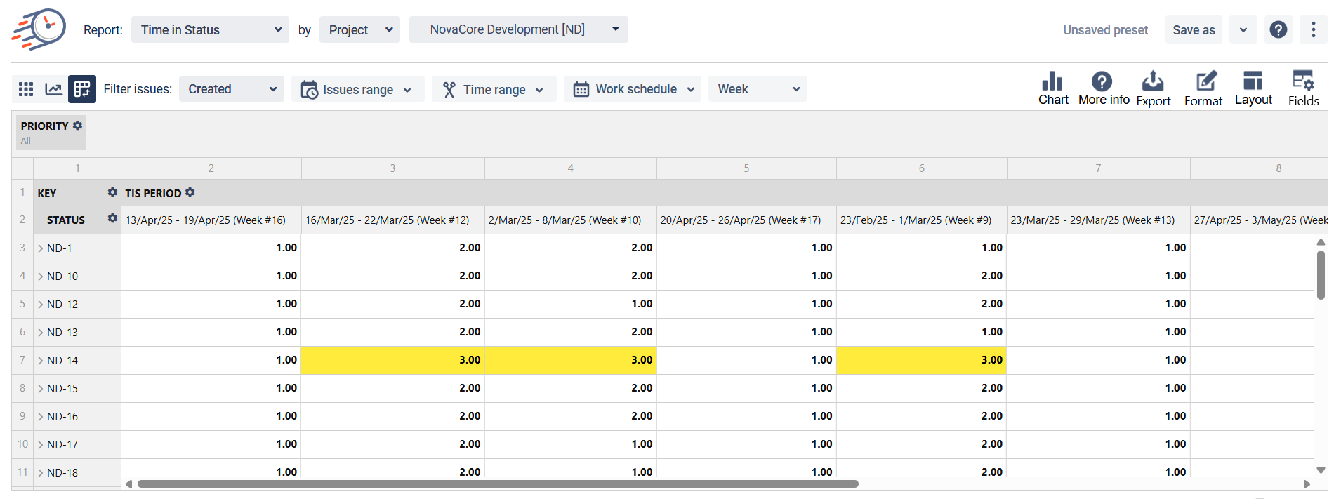
As a result, all cells where the value is bigger than the specified number will be highlighted with the color you’ve chosen.
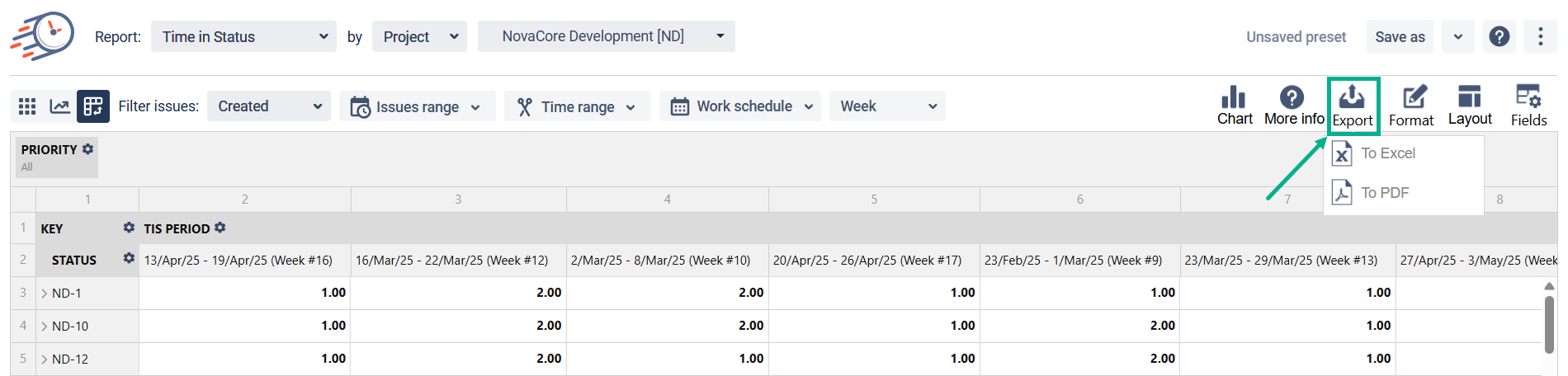
7. Export to the Excel or PDF files is available.
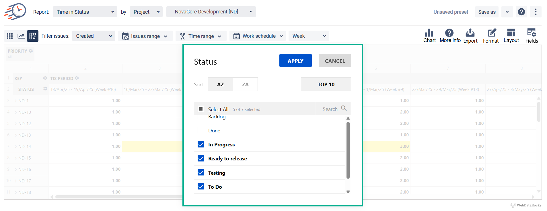
8. The Filter function allows you to filter a range of data based on your criteria. To do it, click gear near them and check the necessary options.
If you need help or want to ask questions, please contact SaaSJet Support or email us at support@saasjet.atlassian.net
Haven't used this add-on yet? Try it now!