Graph that shows the times an issue has entered a specific state
🤔 Context: A team lead needs to analyze how frequently issues transition through various states to identify workflow patterns and potential bottlenecks.
🌧️ User Problem: As a team lead, I need to visualize the number of times an issue has been in each state to understand our workflow dynamics better. This helps in identifying areas where issues may be getting stuck and improving overall process efficiency.
☔ Solution: Using the State Count report in the Time in State app, you can easily configure and visualize the state transitions of issues. Here’s how:
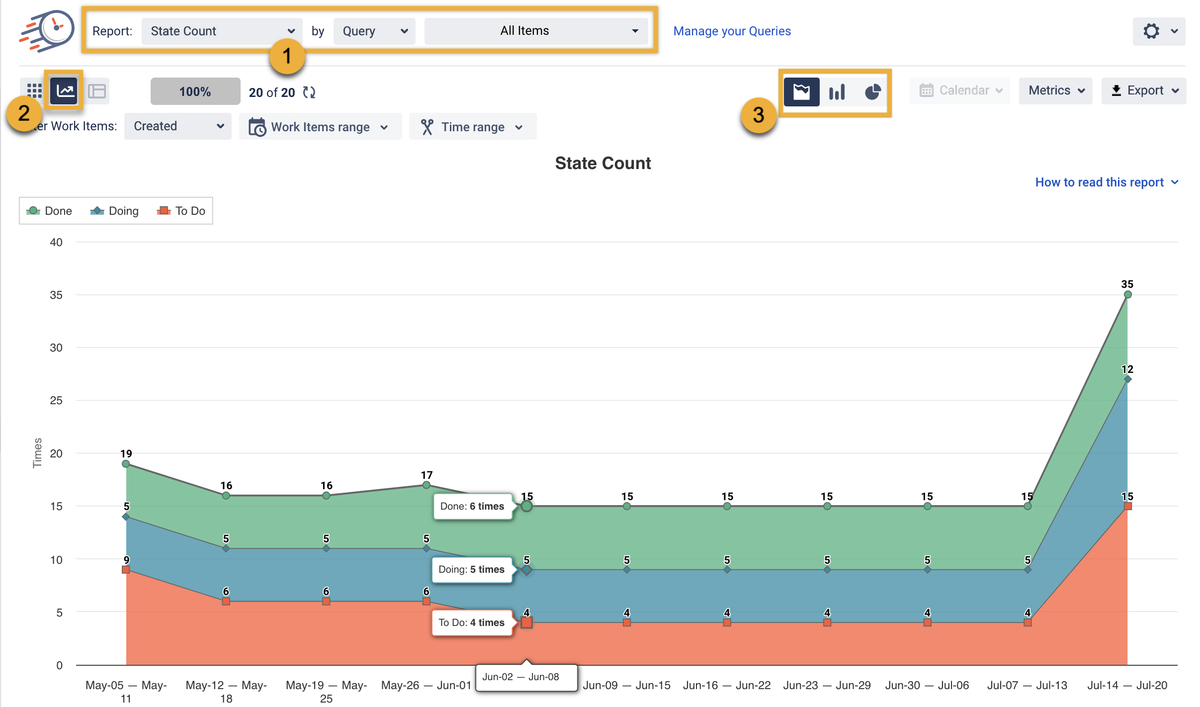
Choose State Count Report an Query you need
Switch to the graph view.
Choose the Area, Bar, or Pie Chart Type.

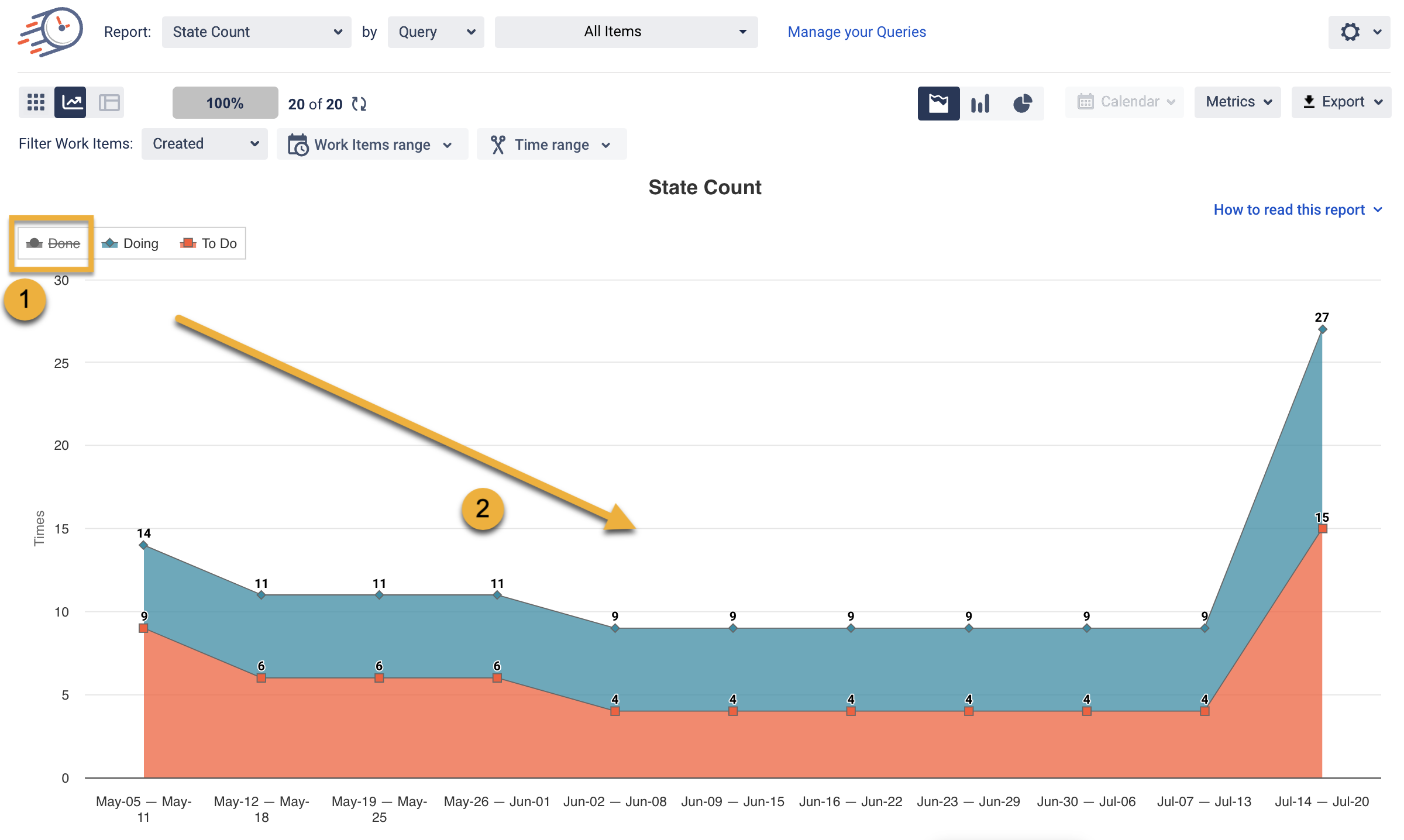
If you want to get the numbers for some state only, uncheck the unnecessary ones by tapping the states.

That’s it! Now, you can create a graph to show how many times an issue was in a specific state.
If you need help or want to ask questions, please contact SaaSJet Support or email us at support@saasjet.atlassian.net
Haven't used this add-on yet? Try it now >>>Time in State for Azure DevOps