
A trendline is a statistical tool that identifies patterns in your data and projects future values based on historical trends.
Each trendline is accompanied by an equation, such as:
y = Ax + B | R² = C
Where:
-
y is the predicted Time in Status (or any other metric you track).
-
x represents the time period (e.g., months, weeks, or sprints).
-
A is the slope, indicating how much the metric changes per time unit.
-
B is the starting value when x=0.
-
R² (R-squared) measures how well the trendline fits your data (a value closer to 1 means a strong correlation).
Example of Column Chart with Trendline to Visualize Data Trends
Let's generate a time in status column chart for a specific project by task for the last four months with a monthly breakdown. We'll get a trendline and a formula.
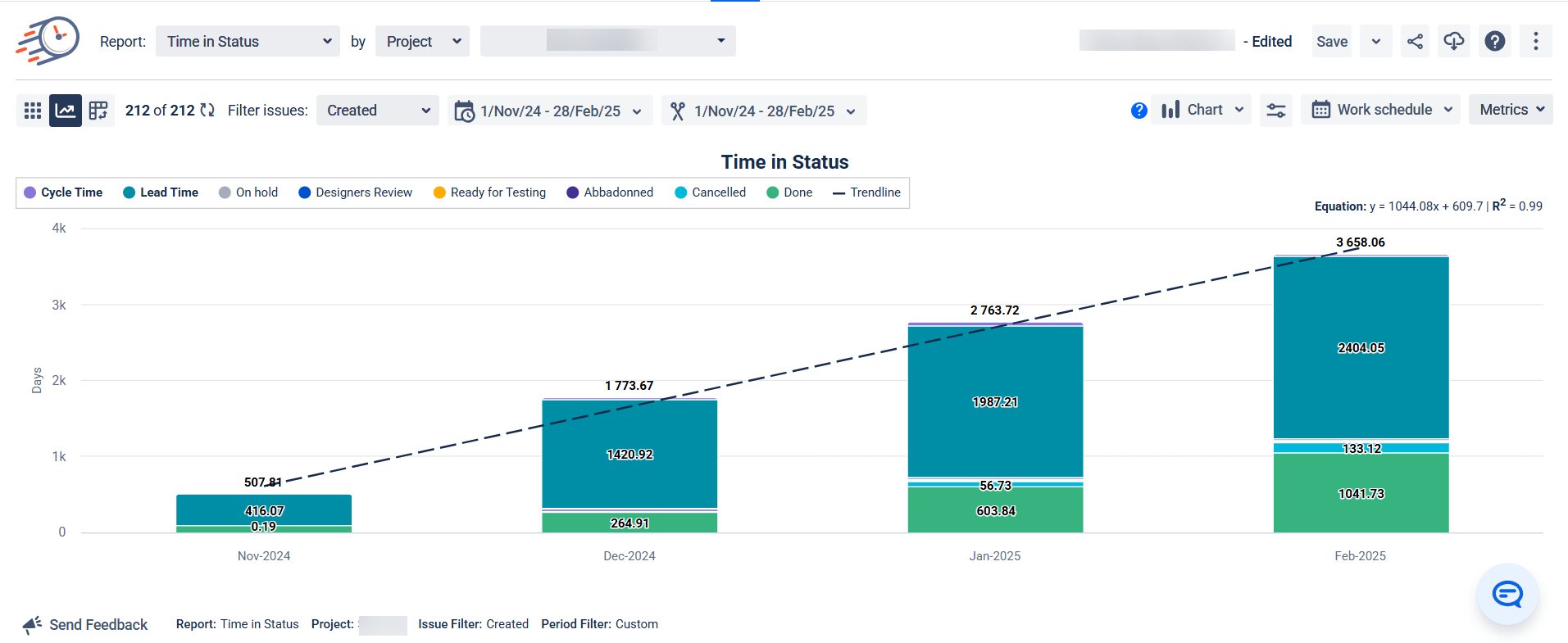
The Equation: y = 1044,08x + 609.7 | R² = 0.99
What the Variables Mean
-
y: This is the "output" value we're trying to predict – in this case, the total Time in Status (in days).
-
x: This represents the time period (month), where we might assign x = 1 for November 2024, x = 2 for December 2024, and so on.
-
1044,08: This is the slope – it tells us that, on average, the total time increases by about 1044,08 days each month.
-
609.7: This is the y-intercept – the theoretical starting value when x = 0.
What R² = 099 Means
The R² value tells us how well the line fits the actual data points:
-
A value of 1.0 would mean perfect prediction.
-
A value of 0.0 would mean no relationship.
-
0.99 means the linear model explains about 99% of the variation in the data – strong fit.
How to Forecast Using This Formula
To forecast using the formula y = 1044,08x + 609.7 | R² = 0.99, you just need to plug the corresponding x-value (the month number in this case) into the equation to predict the Time in Status (y) for that month.
Here’s how you can do it:
Steps to Forecast Using the Formula:
-
Identify the week number (x) that you want to forecast for. For example, if you want to forecast for the 5th month (March 2025), then x = 5.
-
Plug the month number (x) into the equation:
y = 1044,08x + 609.7
-
Solve for y (the predicted Time in Status in days) by performing the calculation.
Example: Forecast for the 5th Month (x = 5)
y=1044,08x + 609.7
y=5 220,4+609.7
y=5 830,1
So, for the 5th month (March 2025), the predicted Time in Status would be approximately 5 830,1 days if the trend continues.
Possible Use Cases
-
Predicting Future Delays: If your trendline shows an increasing Time in Status, you can anticipate bottlenecks before they cause serious issues.
-
Monitoring Process Improvements: After implementing workflow optimizations, the trendline helps determine if your changes reduce cycle or lead times.
-
Setting Data-Driven Goals: Instead of setting arbitrary efficiency targets, use trendline insights to define realistic expectations for your team.
-
Justifying Additional Resources: If trend analysis shows a steady increase in resolution time, you can present solid data to advocate for more team members or automation tools.
-
Capacity Planning: By forecasting future workload trends, you can better distribute tasks among teams and avoid burnout.
-
Evaluating Project Risks: Teams working with tight deadlines can use trend analysis to spot risks early and take action before problems escalate.
Why This Feature is a Game-Changer
Unlike static reports that only show past performance, the trendline gives you a forward-looking perspective. It helps teams stay proactive rather than reactive, ensuring smoother workflows and better decision-making.
By making data visualization and forecasting effortless, this feature empowers teams to:
✅ Identify inefficiencies before they escalate.
✅ Improve workflow predictability
✅ Back decisions with solid data
✅ Optimize resource allocation and prevent team overload
✅ Provide better reports and insights to stakeholders
If you need help or want to ask questions, please contact SaaSJet Support or email us at support@saasjet.atlassian.net
Haven't used this add-on yet? Try it now!